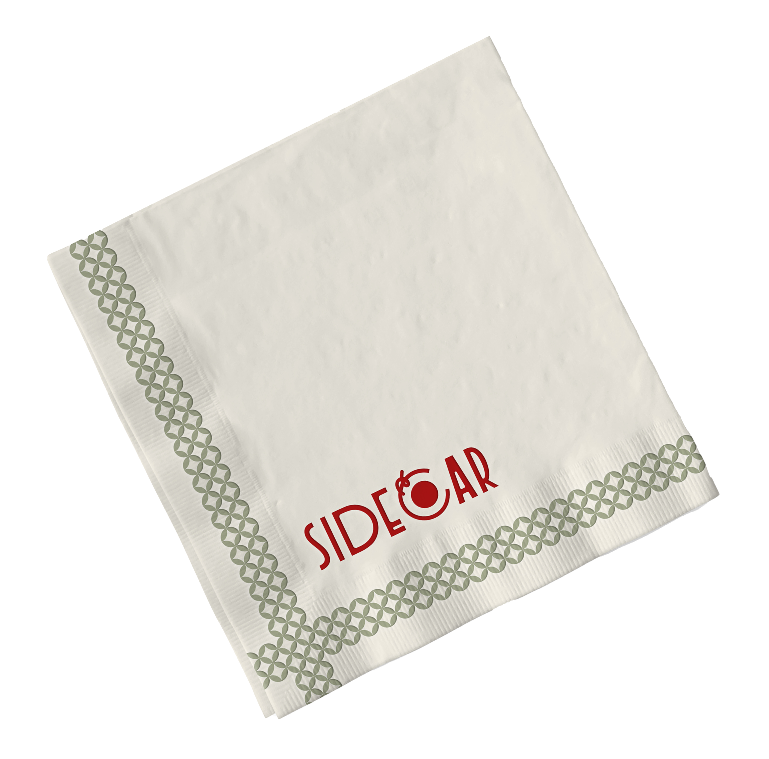
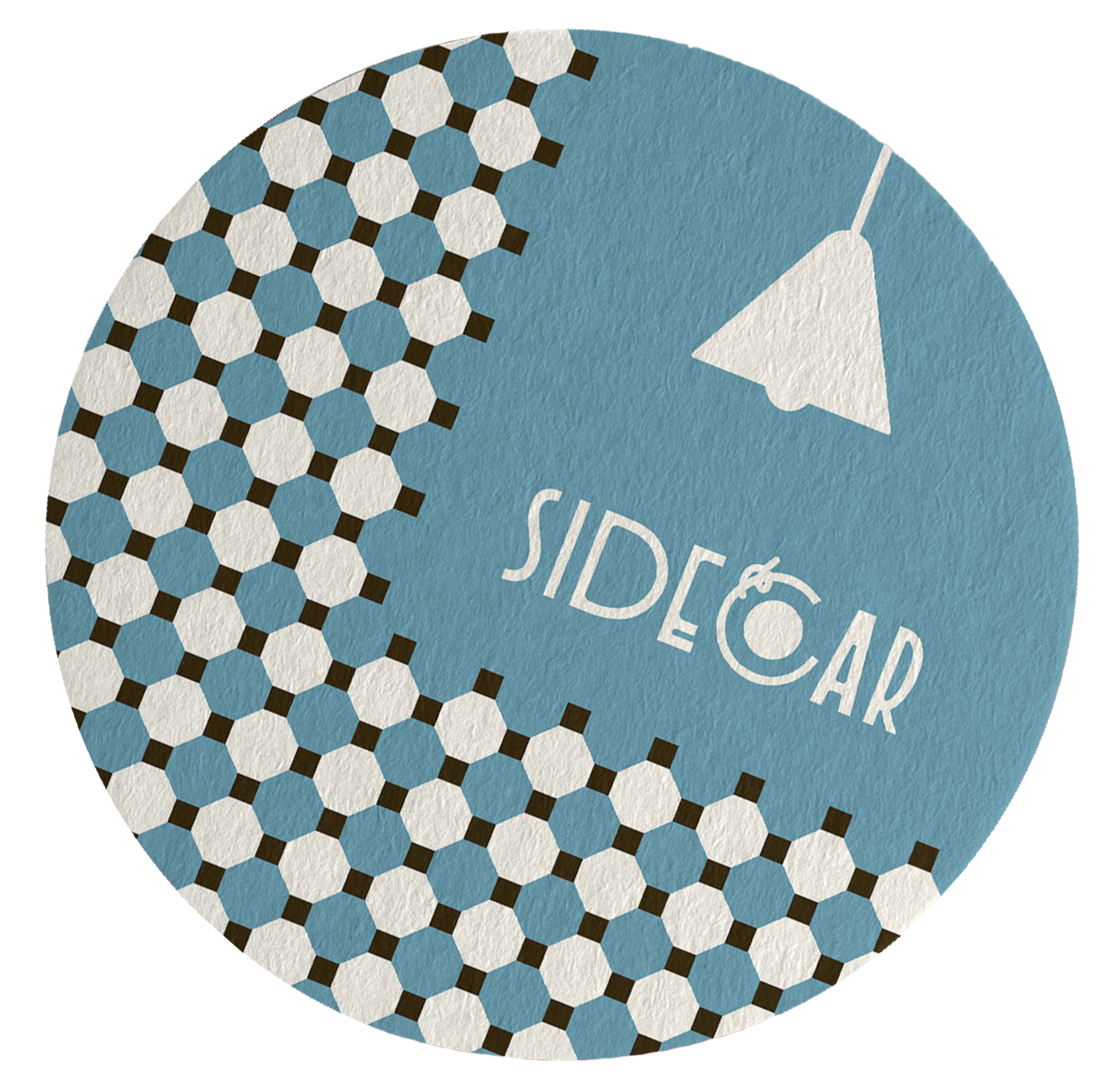
Sidecar
2025
Brand Identity / Art Direction / Motion Design / [Passion Project]

Role
Graphic Design and Art Direction
Software
Figma, Photoshop and Illustrator
AI Tools: Adobe Firefly and Gemini Nano Banana
Photography
Pexels stock
“A bar & lounge brand identity inspired by the 1930s European cocktail culture.”

Brand Mission
To foster face-to-face interaction between people, reviving the dynamic at lounges and bars, where new connections are formed and cherished relationships are nurtured.
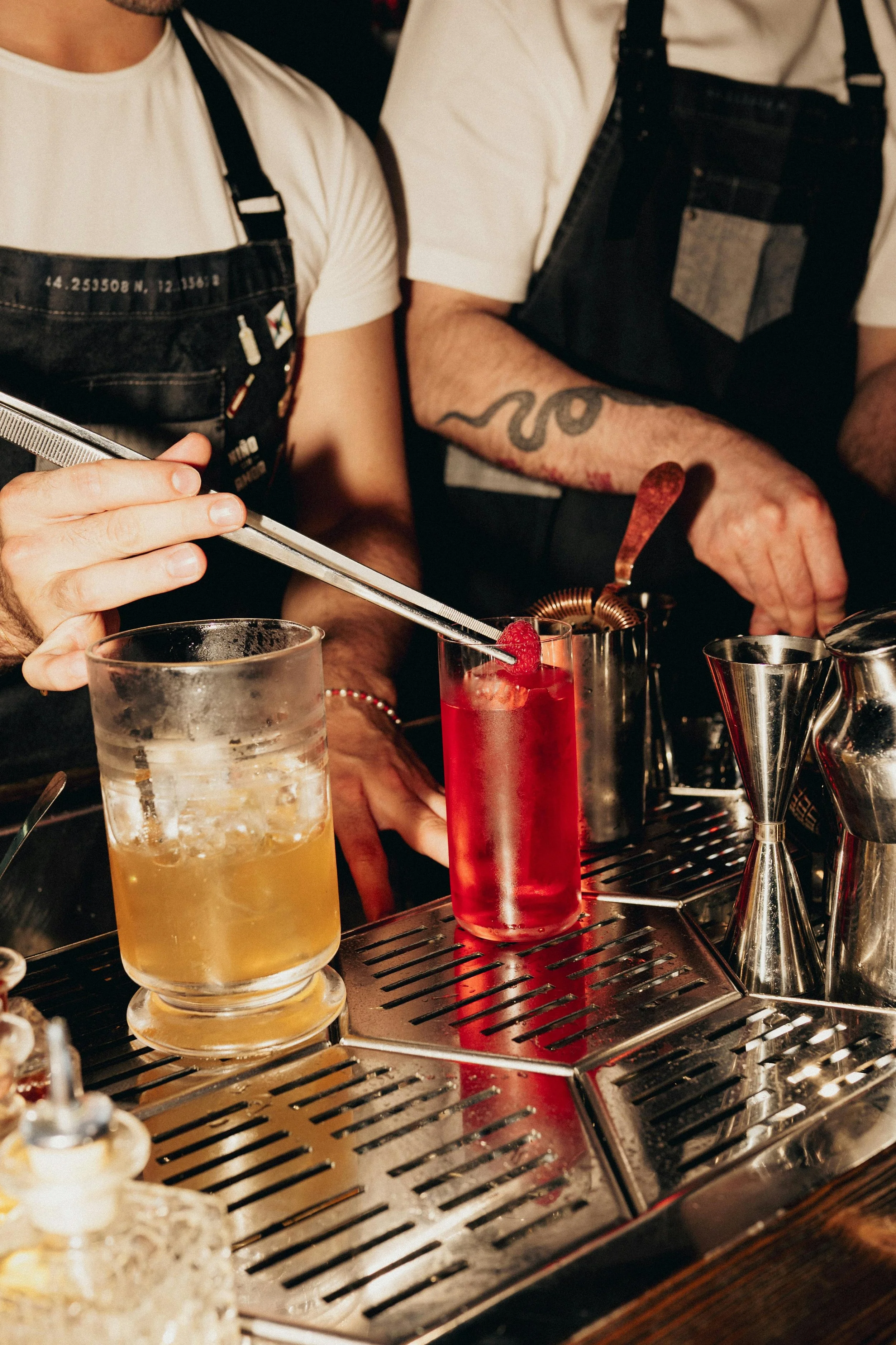
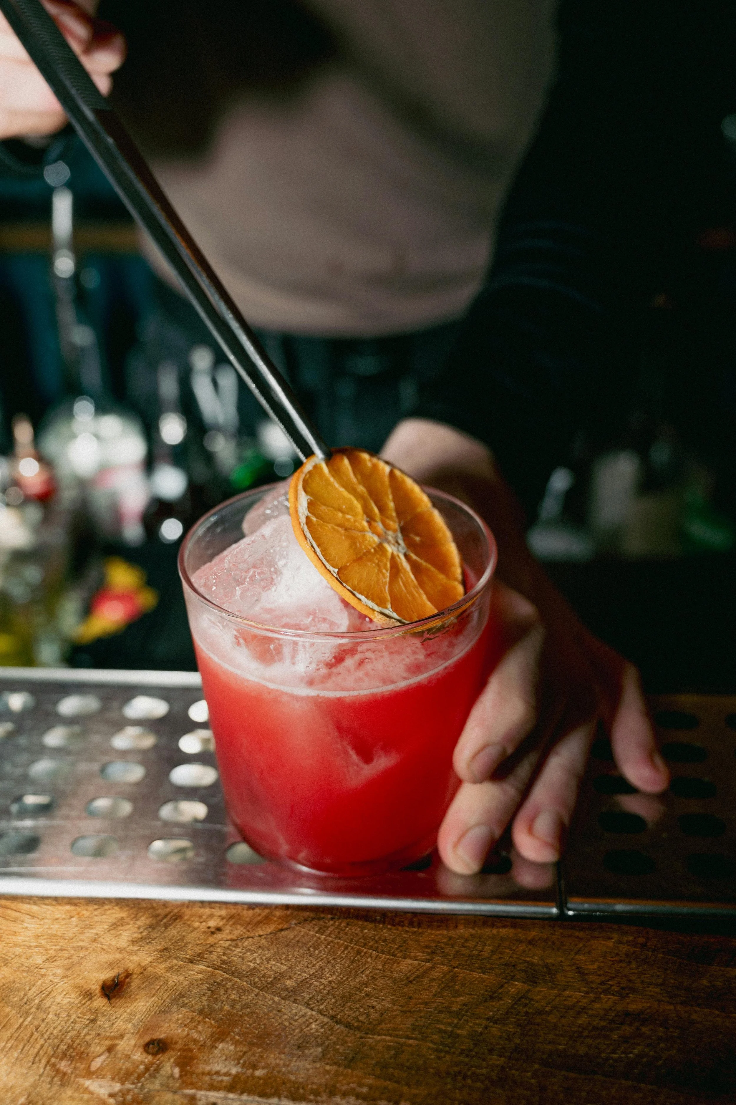
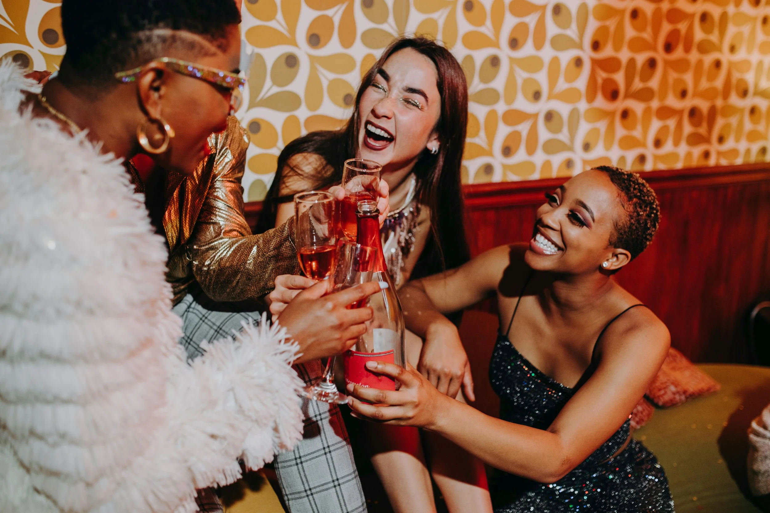
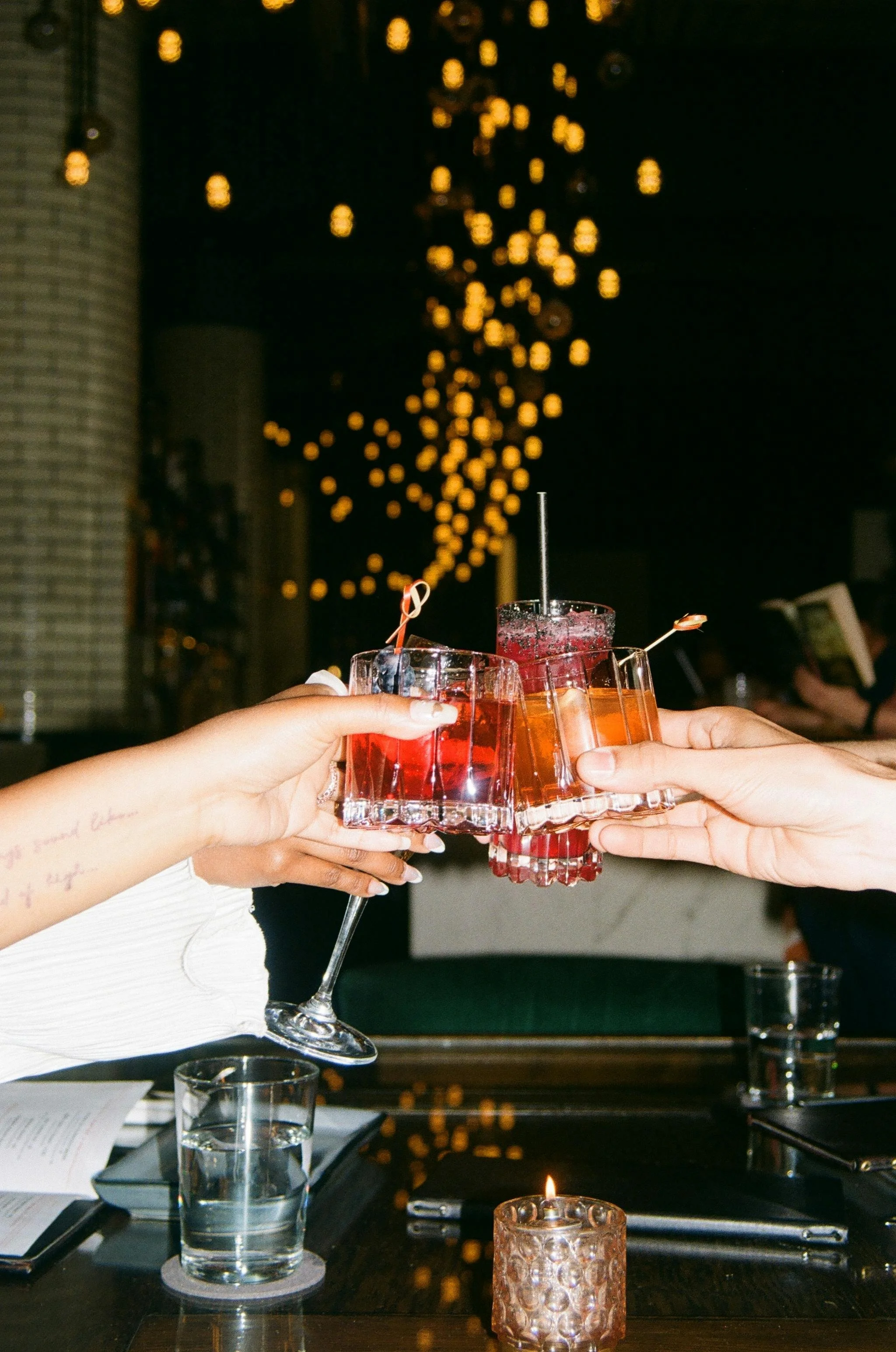
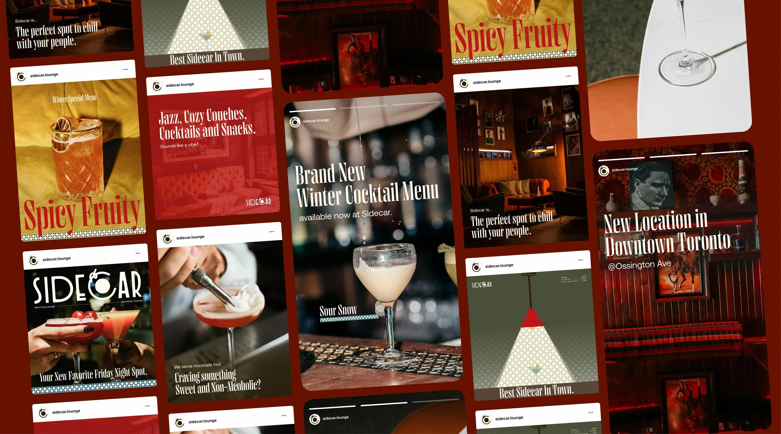
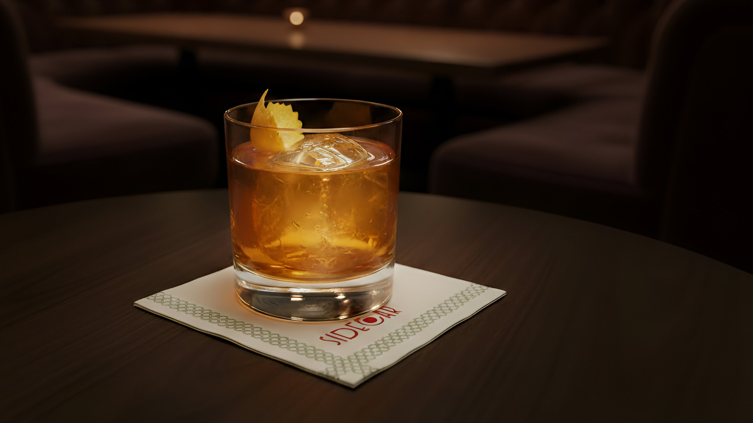
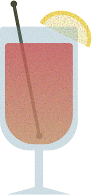
Brand photographs are characterised by capturing groups of friends cheering over drinks or food in low-light bar environments, using soft, warm ambient light combined with flash for bold contrast.
Art Direction
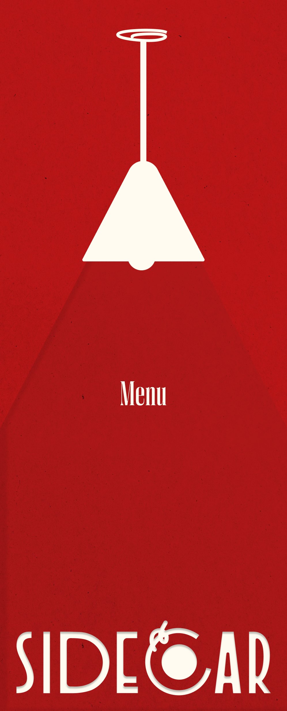
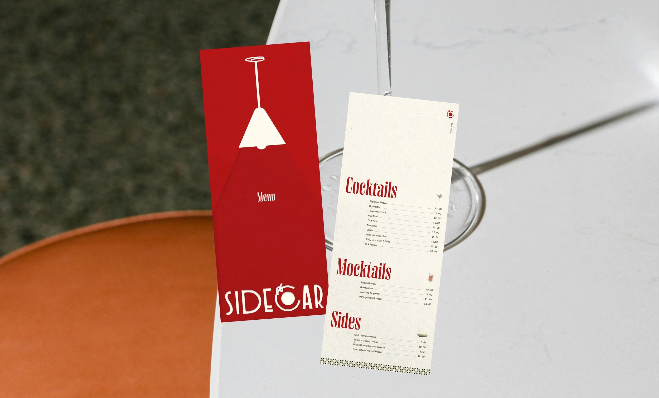
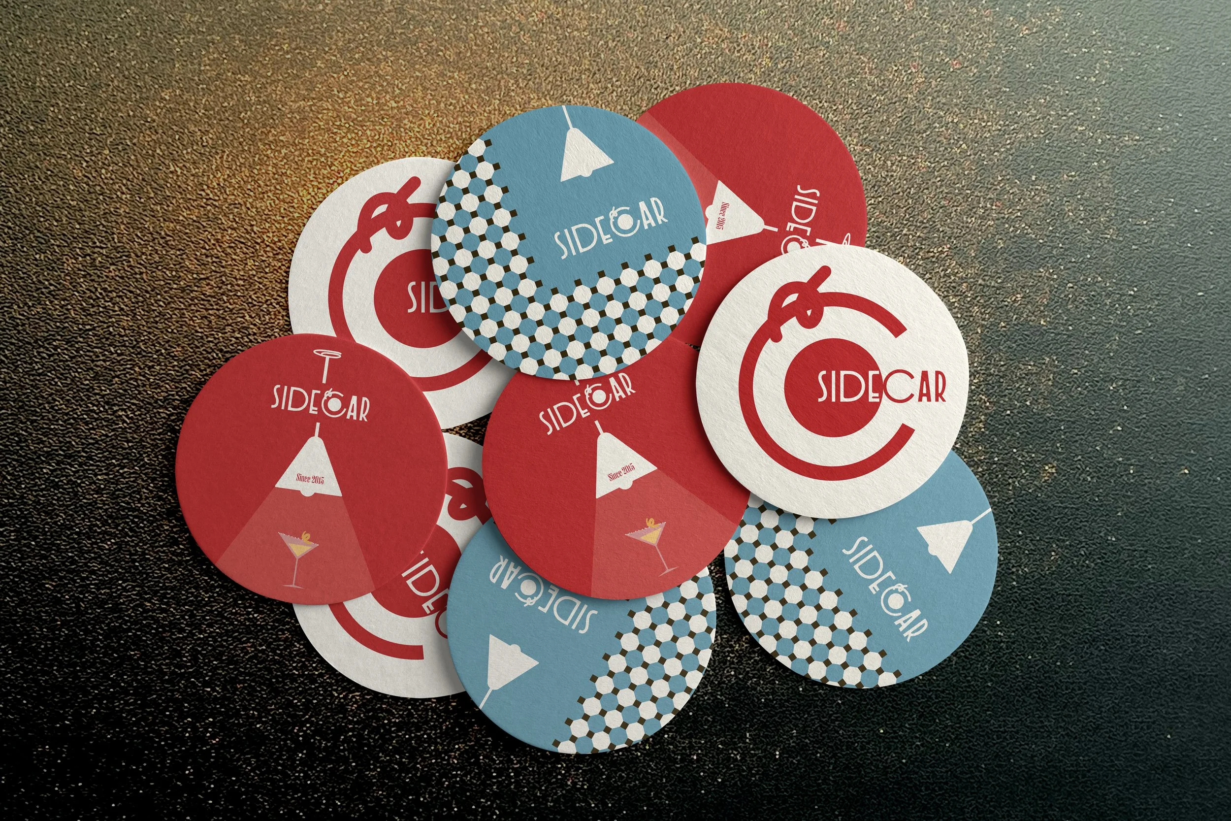
Logo System
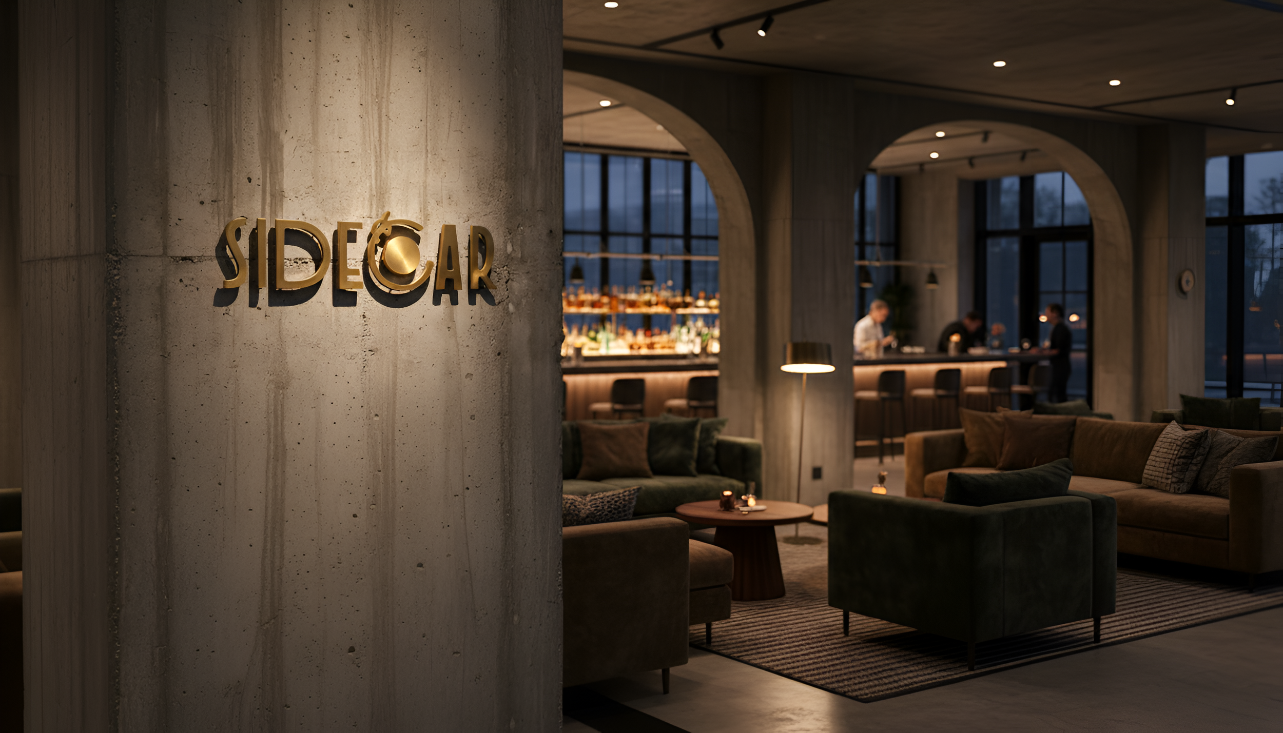
(Primary)
(Alternative Wordmark)
(Submark)


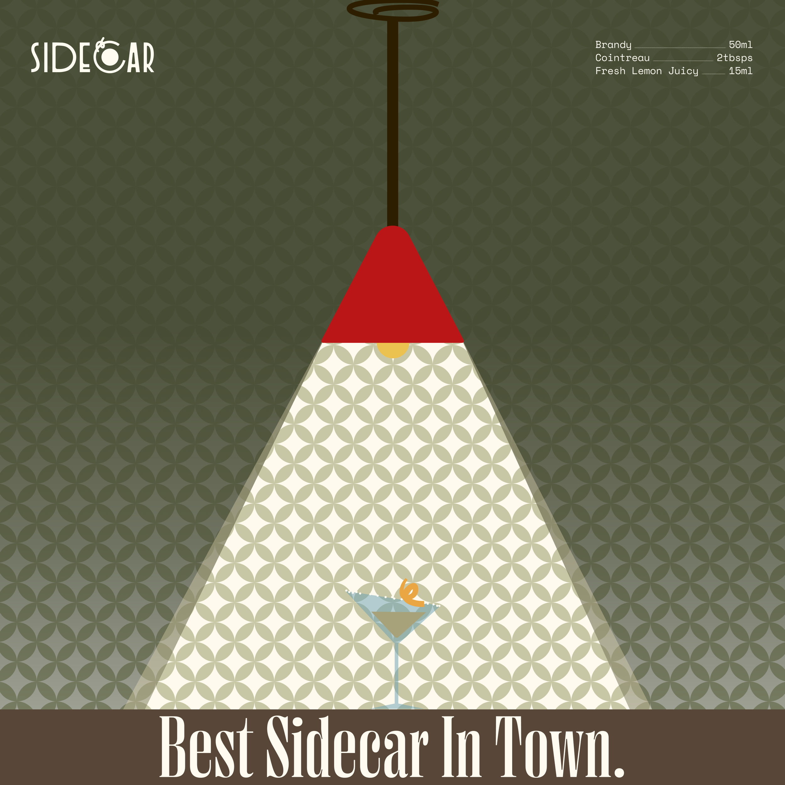
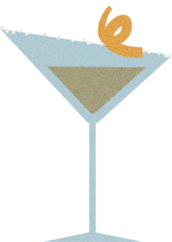
Originated from the classic 1930s cocktail, sidecar. It’s a beverage with cognac and orange liqueur as base, garnished with a sugar rim and orange twist.
Brand Name
The ‘C’ in the brand name draws inspiration from the top view of a cocktail glass, incorporating details like liquor and an orange twist to visually evoke a Sidecar cocktail.
Logo Concept
The Art Deco font Organda MN embodies the brand’s back-to-basics philosophy, echoing the 1930s Art Deco movement’s preference for streamlined, practical design rather than extravagance.
Font
Logo in Motion
Bringing the logo concept to life through motion: the letter “C” takes the shape of a cocktail glass, slowly filled with liqueur and finished with an orange twist garnish.

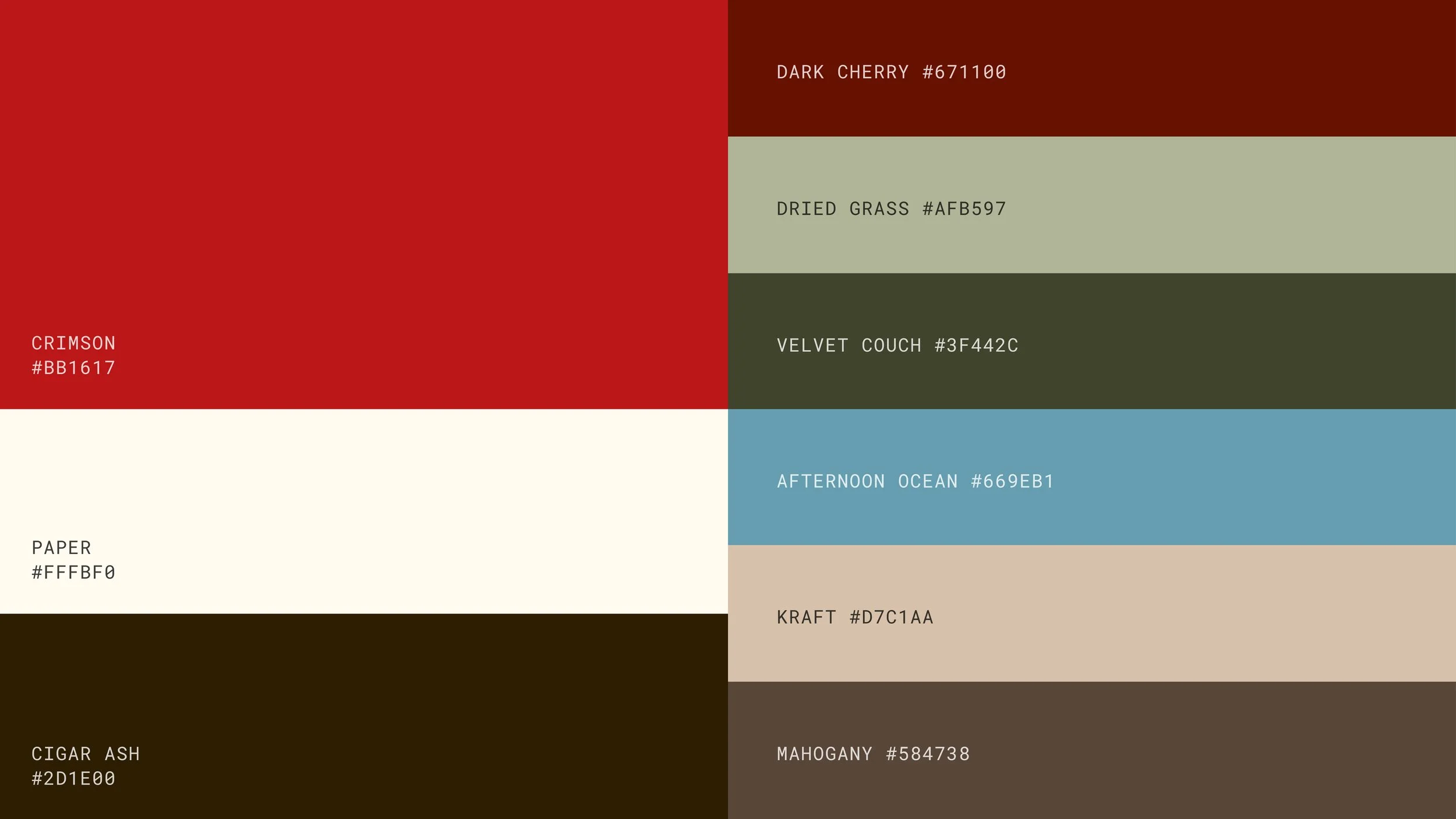
Extending the 1930s European cocktail culture reference, muted tones are commonly featured in European graphic design works from the period: sealing wax red, moss green, cornflower blue, indigo, neutral beige, and browns. Sidecar’s colour system is anchored by a brilliant crimson red, extracted from moodboard photos of bars and lounges decorated with red velvet sofas, bright red neon signs, and designer pendant lights; accent greens, blues, dark cherry red, and neutrals complete the palette drawn from the 1930s colour inspirations.
Colour System

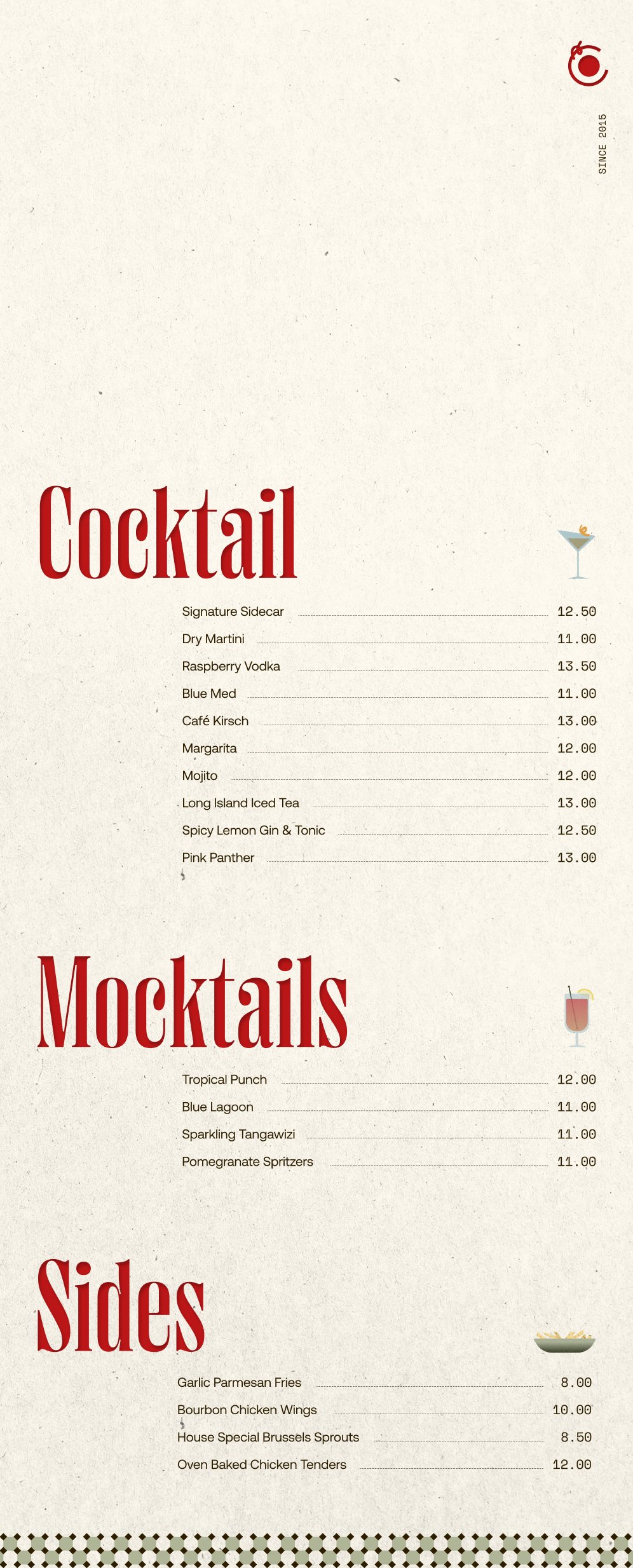
Graphical Elements
(Cocktail)
(Sides)
Key Graphics
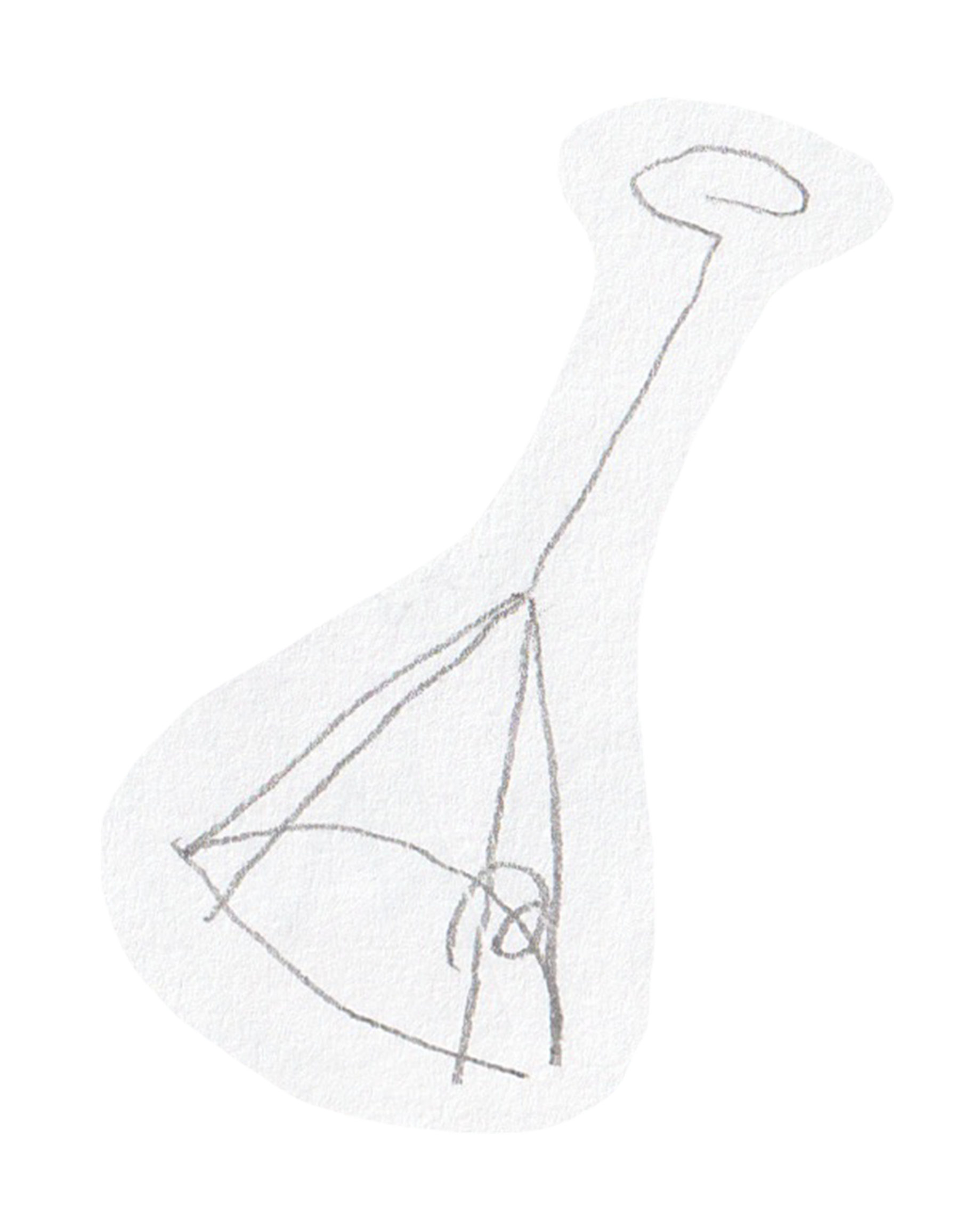
The pendant light is a key brand graphic; it resembles the silhouette of a cocktail turned upside-down.
(Pendant Light)


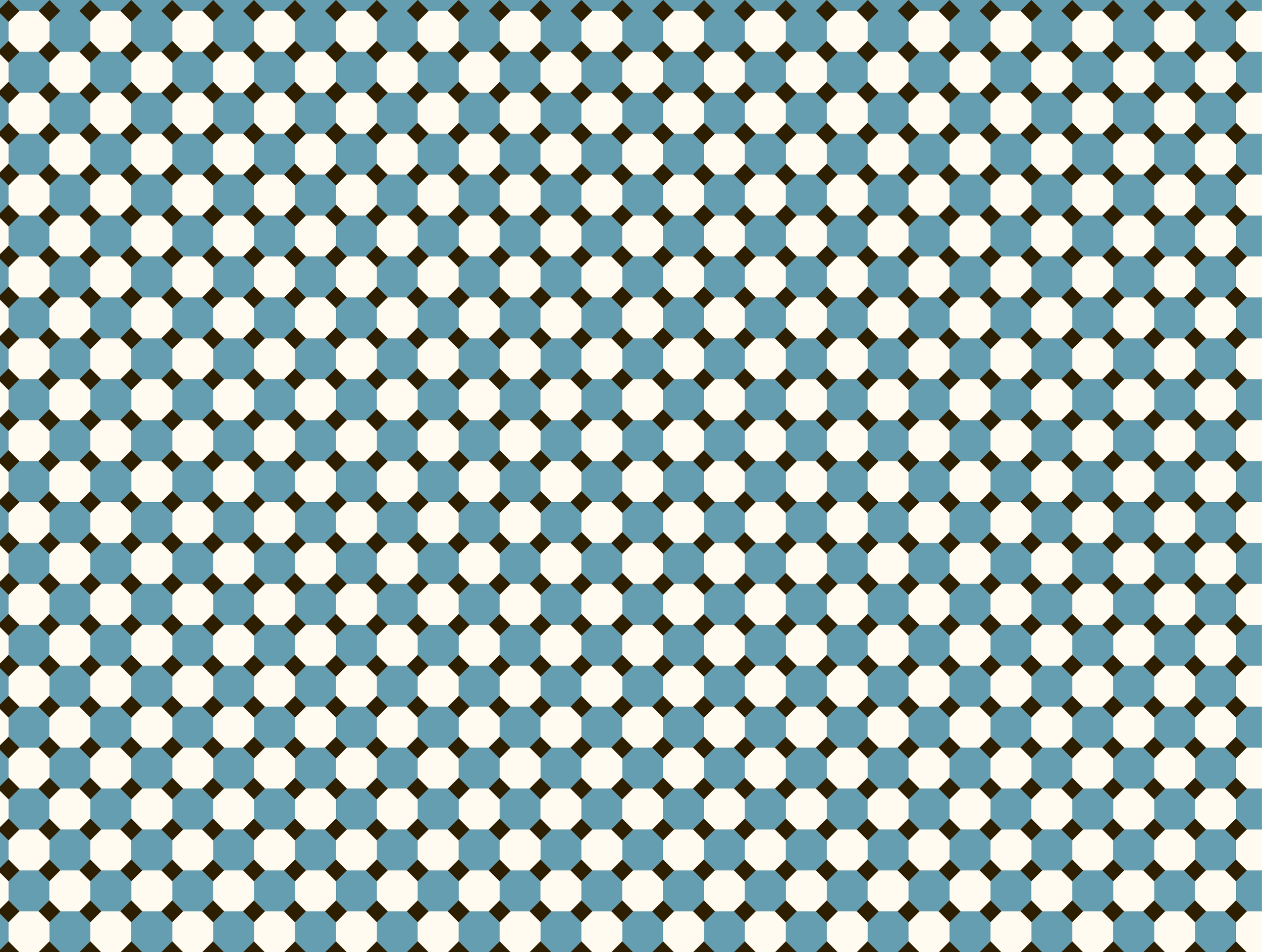
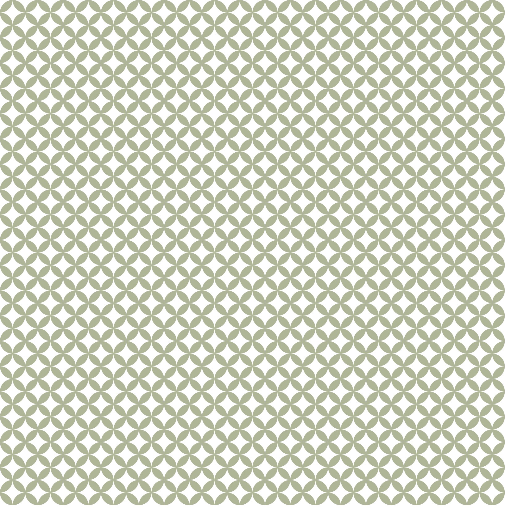
Created for backgrounds and social post decorations. We were inspired by the symmetrical 1930s floor tiles and the Art Deco movement's emphasis on craftsmanship symbolize Sidecar's back-to-basics lifestyle.
Patterns