Gaudy
Brand Identity / Art Direction / [Passion Project]2025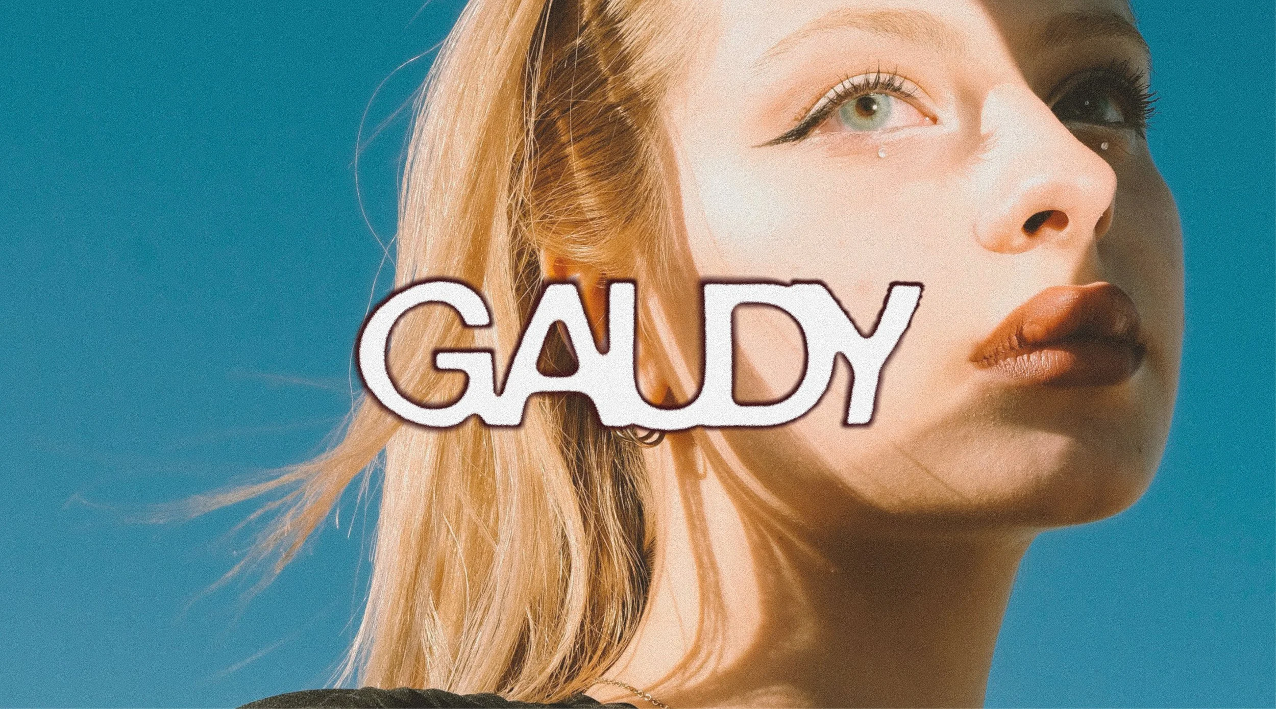
Graphic Design and Art Direction
Role
Figma, Photoshop and Illustrator
Software
Lummi and Pexels stock
Photography
“A bold and playful cosmetic spec brand identity that aims to blur the line between cosmetics and gender.”
Brand Mission
To encourage consumers to unleash their creative inner child through makeup and blur the line between cosmetics and gender.
Striking a balance between gender neutrality and playfulness, incorporating straightforward copywriting that feels personal and encouraging, complementary and analogous colour combinations, and flat shapes of makeup packaging.
Art Direction
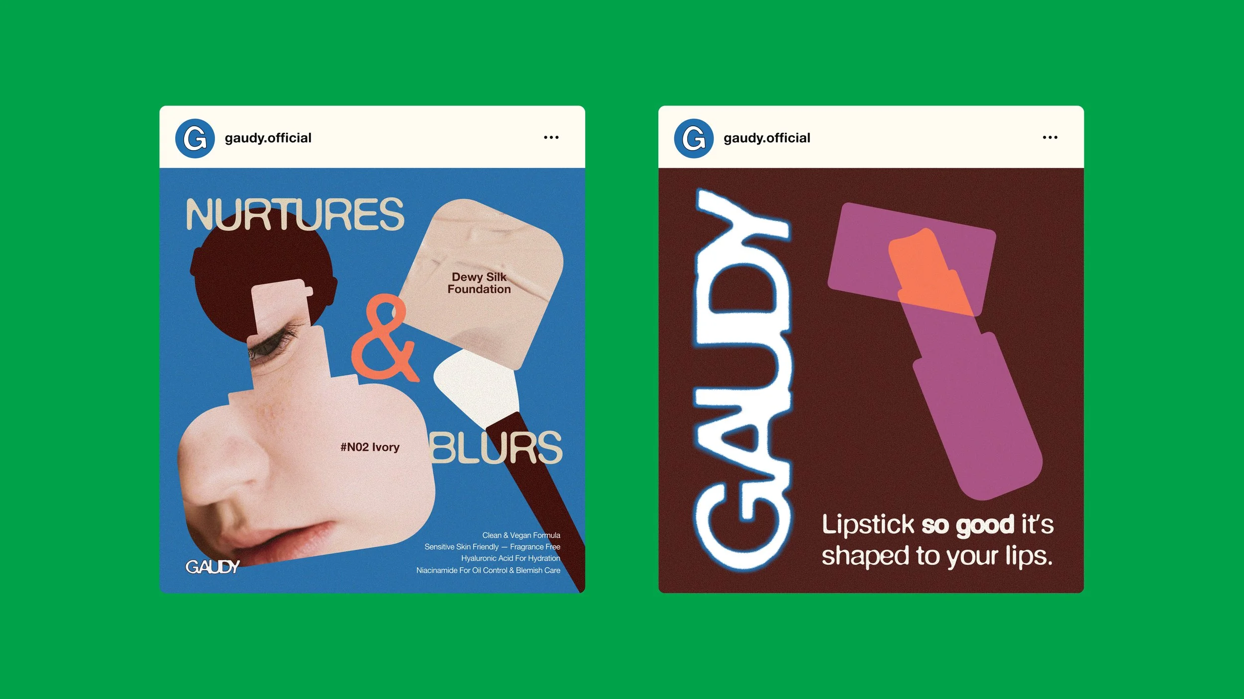
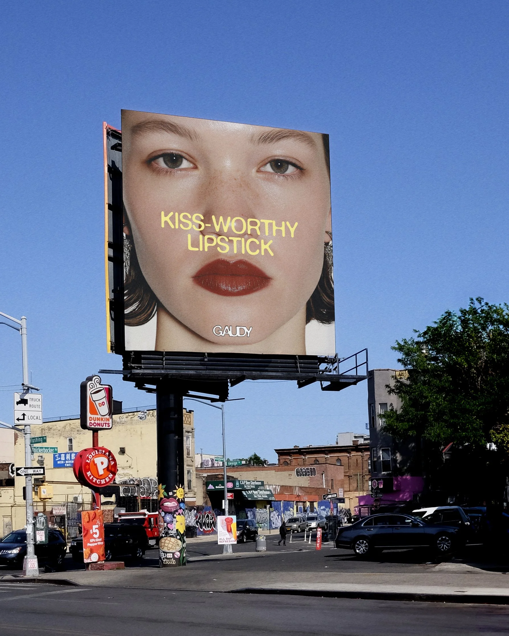
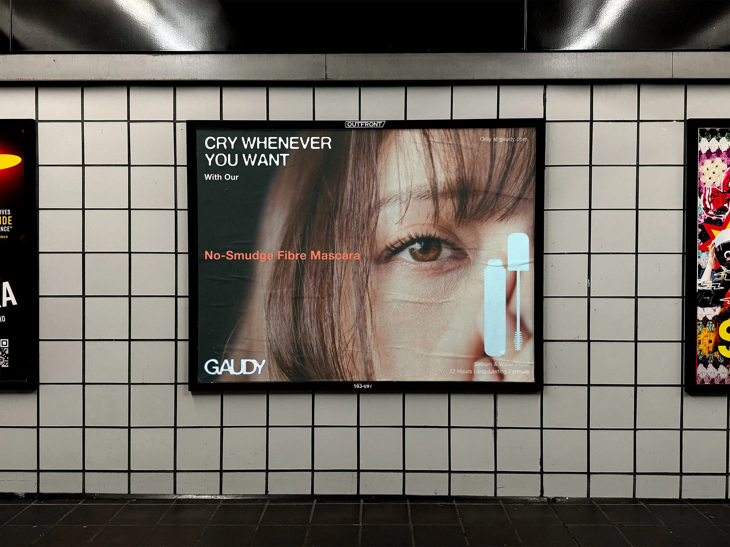
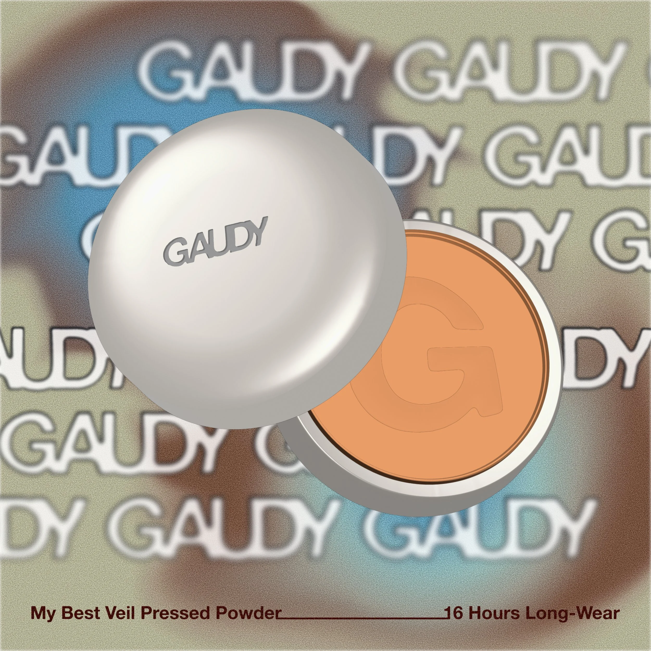
Crisp silhouettes of makeup packaging and facial features harmonize with the blurry wordmarks, headline typography, and busy background images or gradients. Their simplicity helps maintain the core brand message of being gender neutral. They can be used as standalone graphics or as shapes to mask brand photographs.
Noise textures are added to make the brand visuals more coherent and to enhance the mood of the photographs. It gives images and colours a grungier, more vintage look, echoing the brand's core visual reference to 1990s design trends.
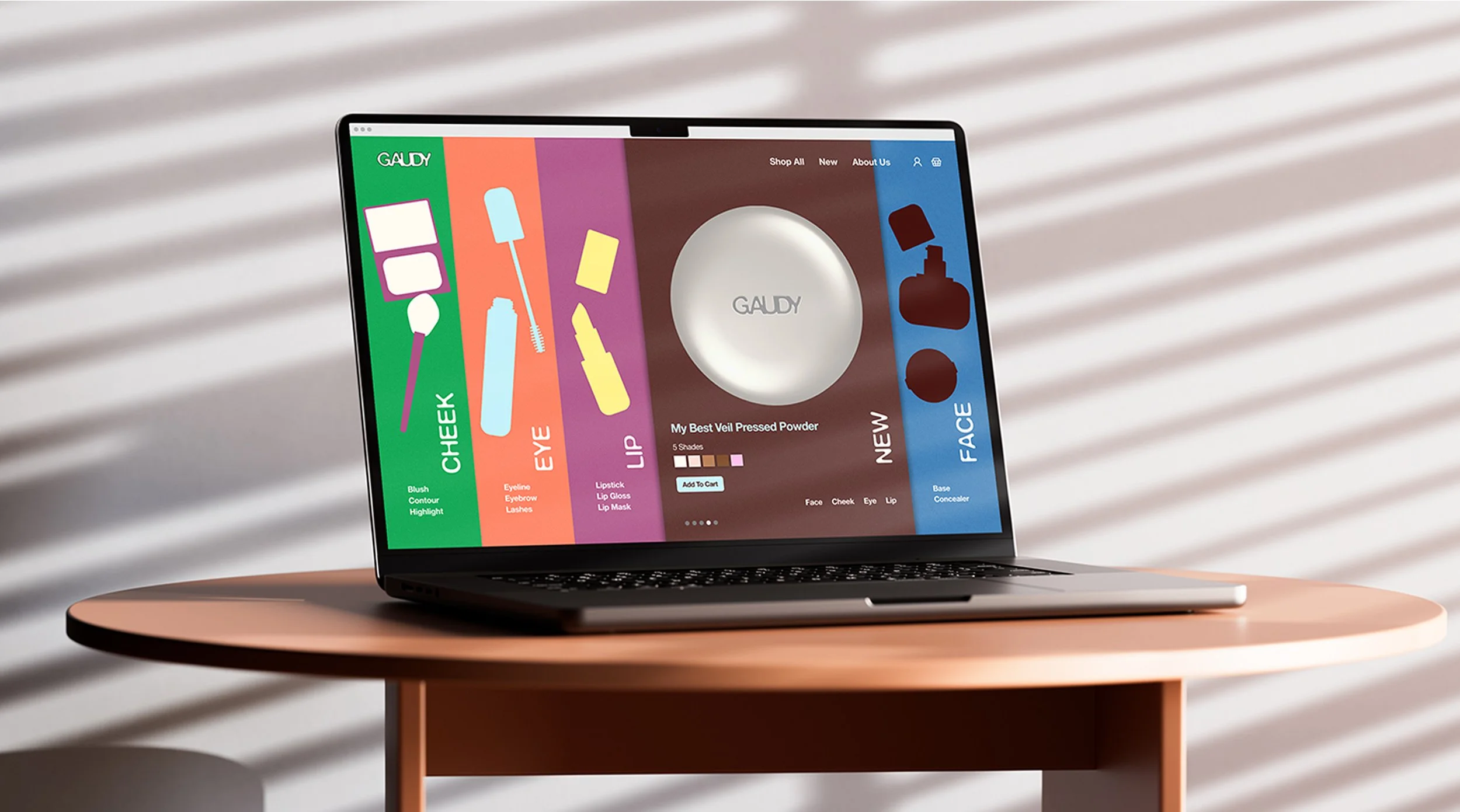
Graphics
Made to be minimal, reflecting the mature side of grown-ups who enjoy doing makeup and the genderless brand identity.
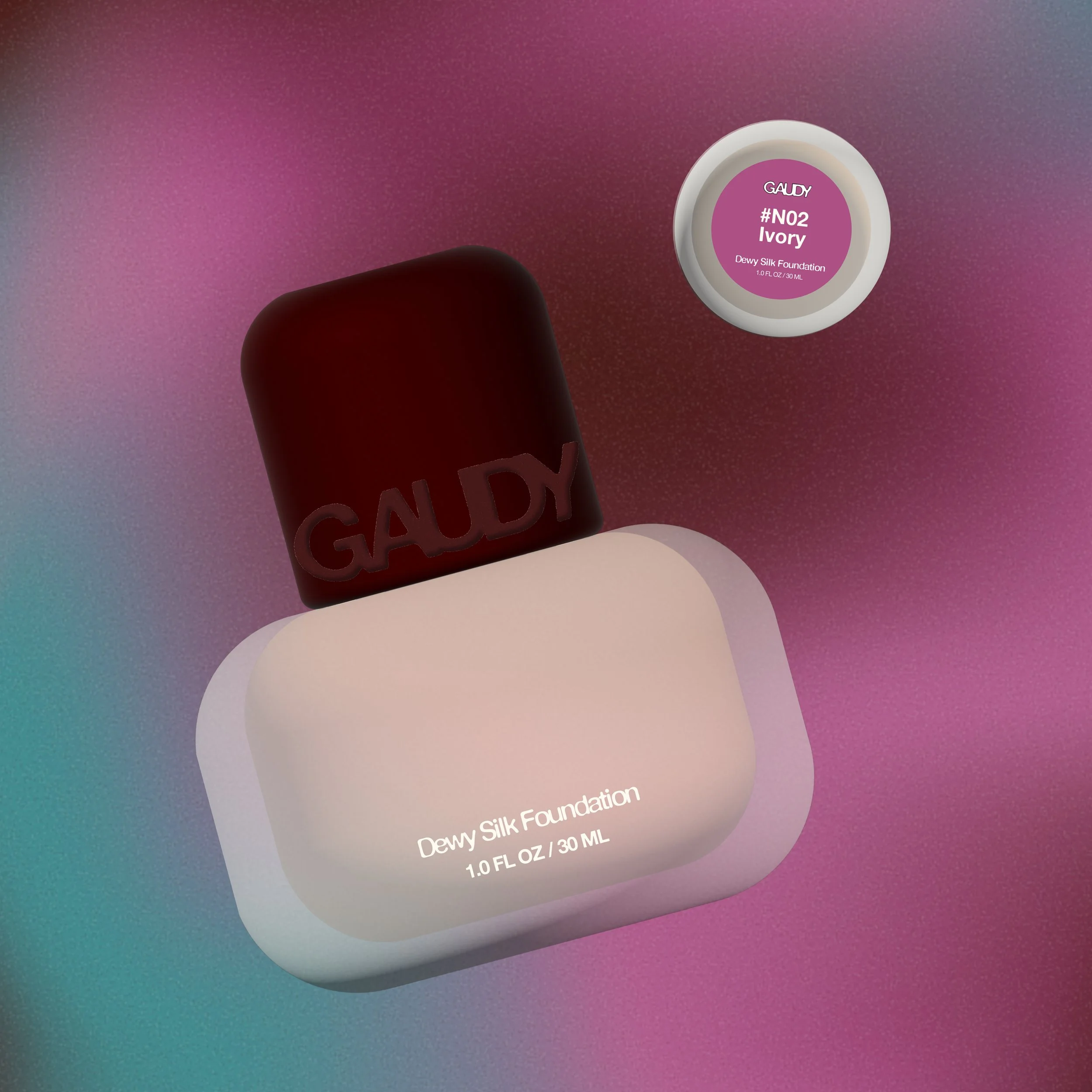
Packaging Design
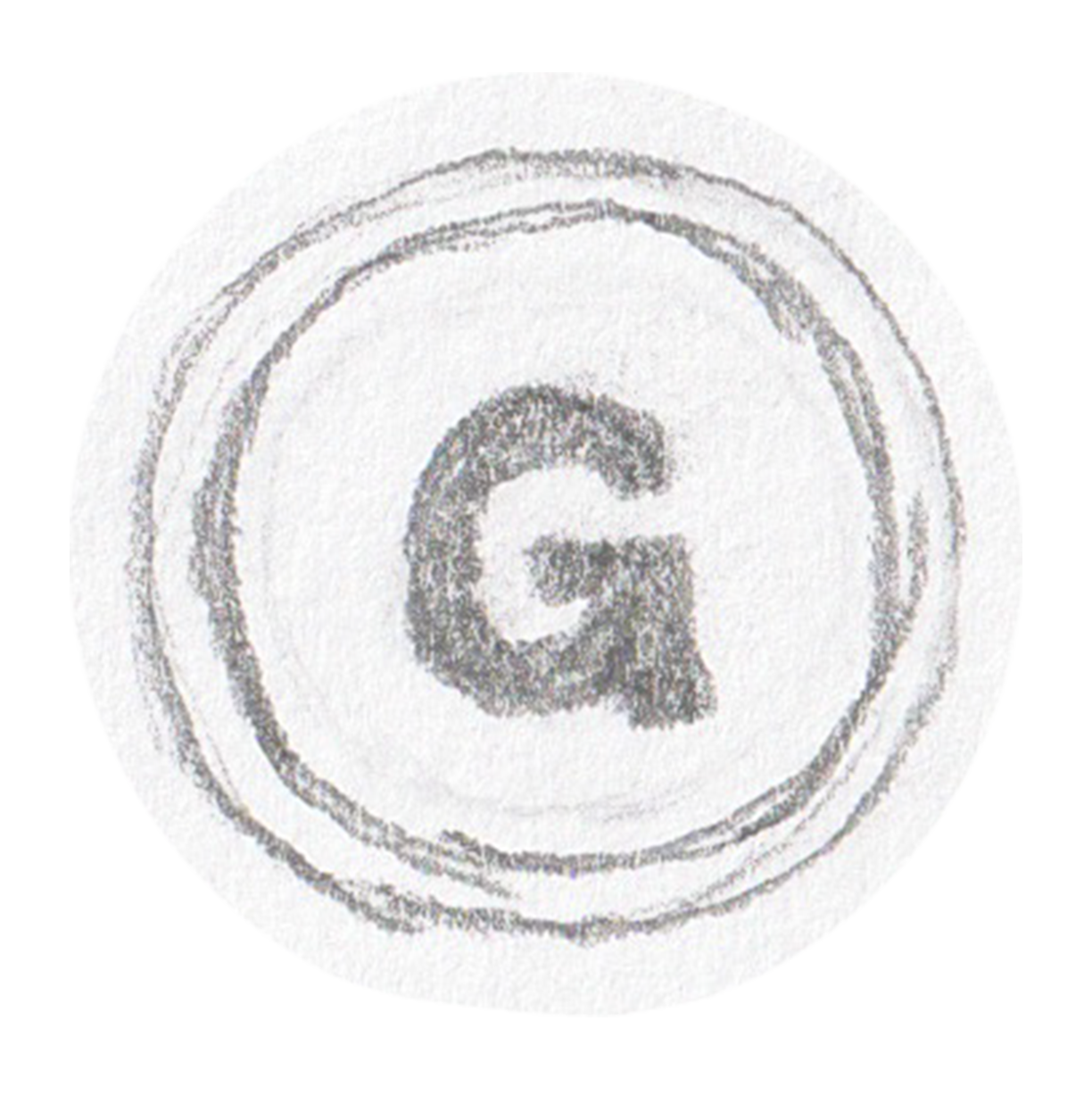
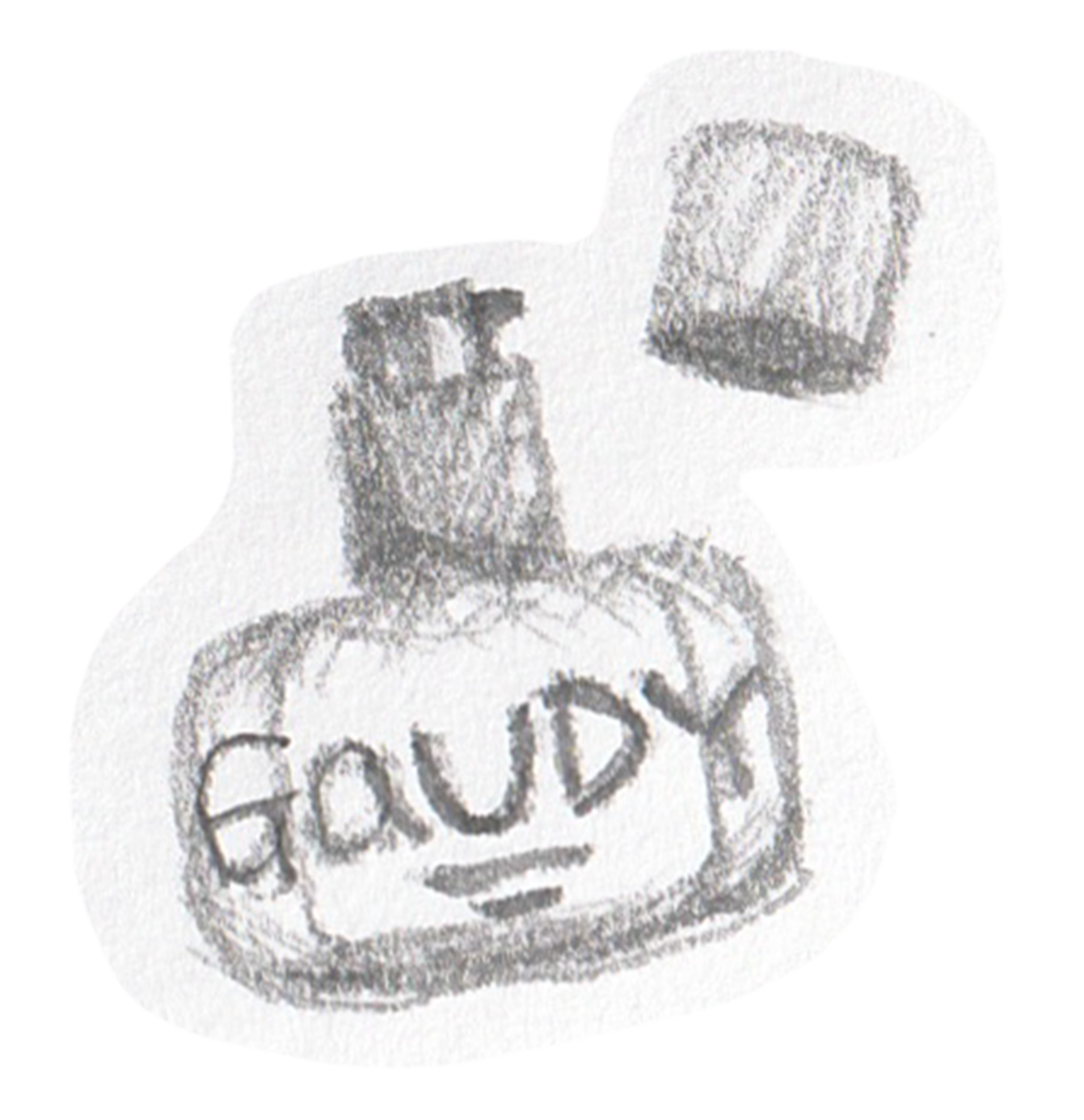
Logo System
(Primary)(Secondary)(Submark)
We are here to prove that you are not weird or too stand outish. Embrace your gaudiness and stay unique.
Brand Name
Inspired by the 1990s' outline bold heading typographic trend. The primary wordmark shows the brand name in a molten form, reflecting the brand's mission of blurring the line drawn between makeup and the target audience's gender. The fisheye warp effect adds to the eagerness to break out of the shell and social stereotypes.
Logo Concept
Developed from the round-cornered bold serif font, DeFonte. It is rendered in an abstract, grunge style with ink bleed/molten effects, reflecting the brand’s plucky, free personality.
Font
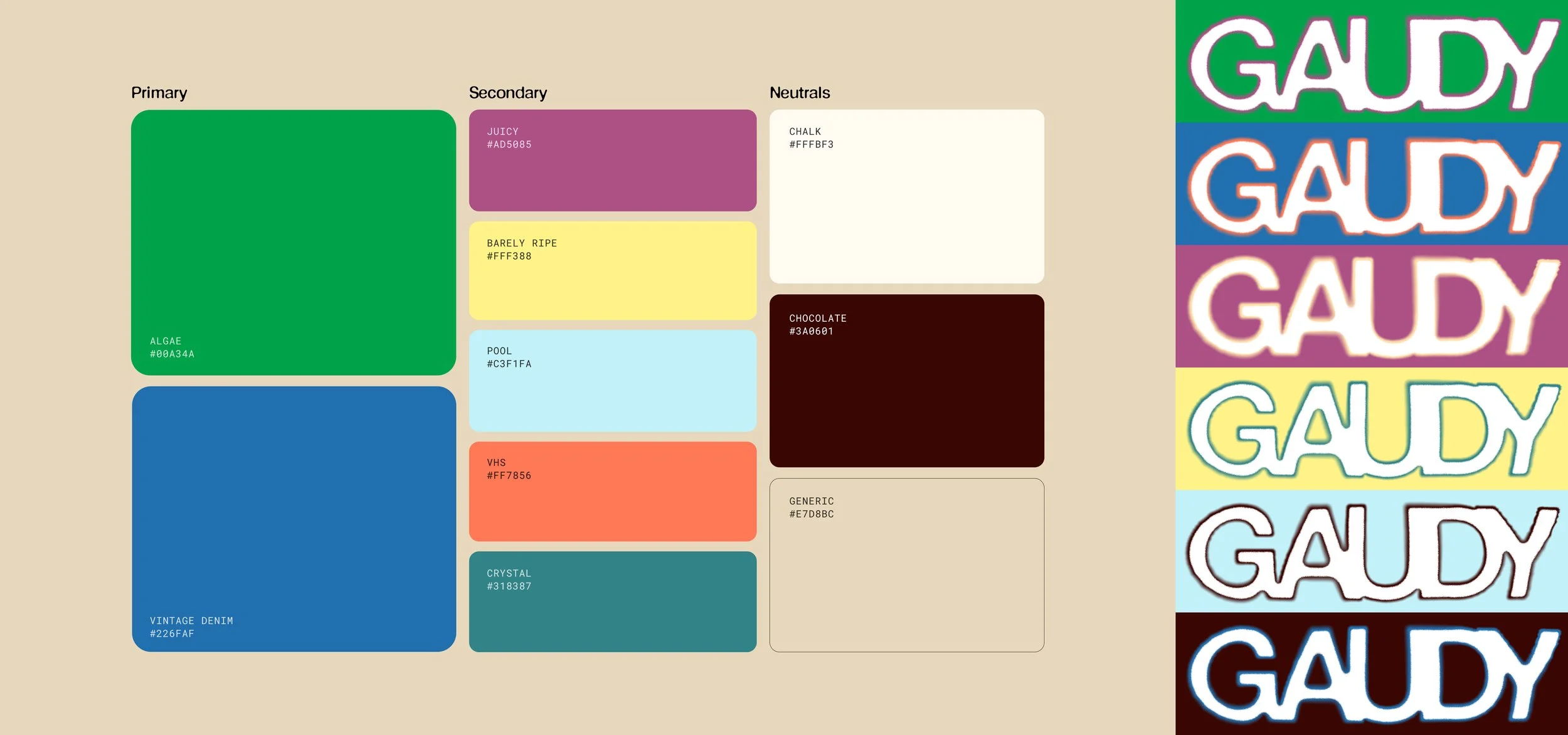
To ensure brand consistency, coloured versions of the primary wordmark are available for brand application in social media posts, packaging designs, website and more.
Colour Variations
Inspired by the Memphis Group’s playful, clashing yellow, purple, blue, and pink colour combination and its retro aesthetic, often described as kitsch and tacky. Gaudy’s colour system is a vibrant yet toned-down adaptation of the iconic Memphis Group palette, reflecting the brand's adventurous yet down-to-earth personality.
Colour System
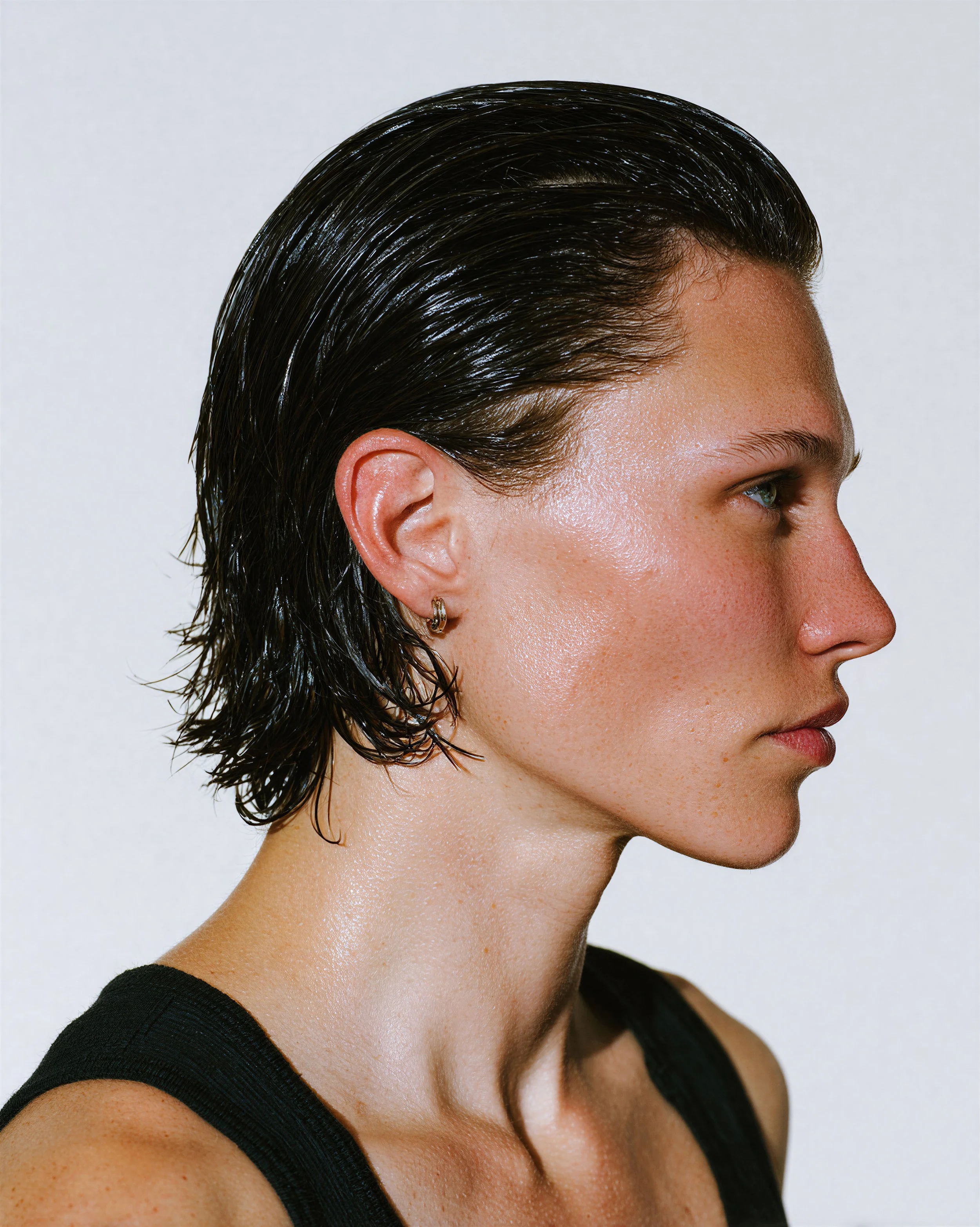
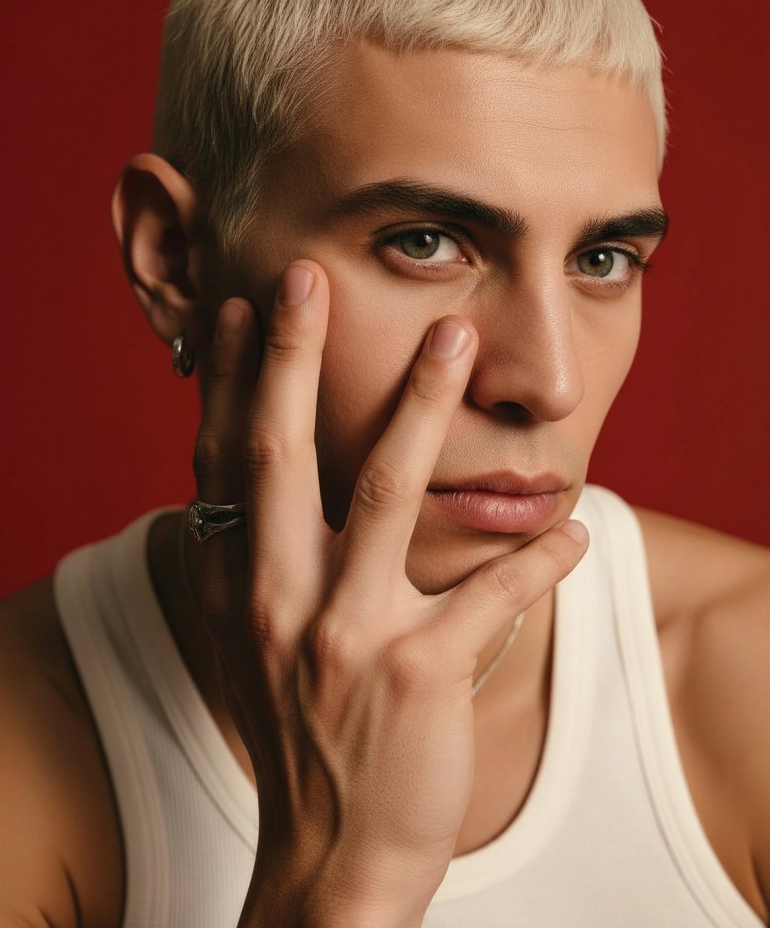
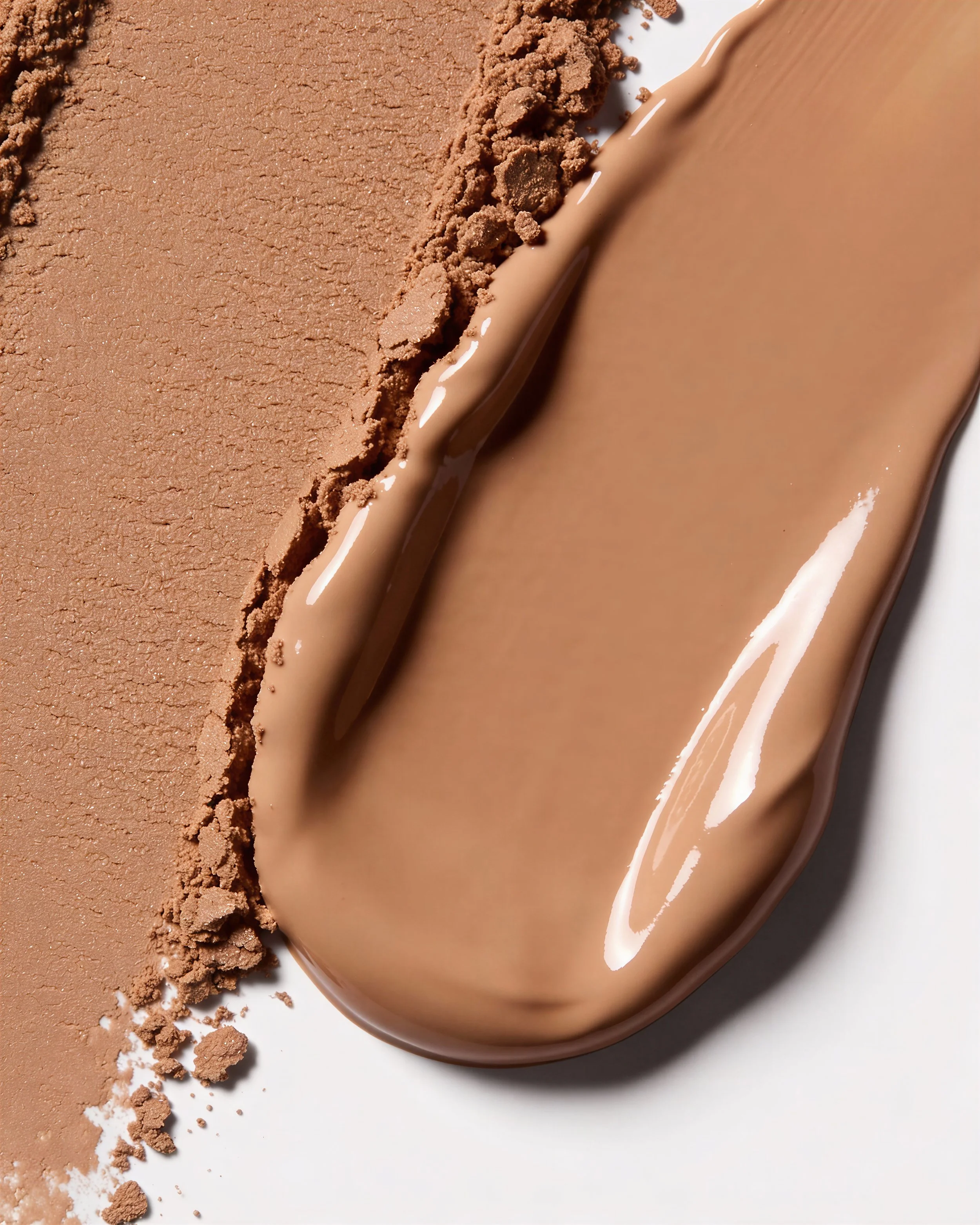
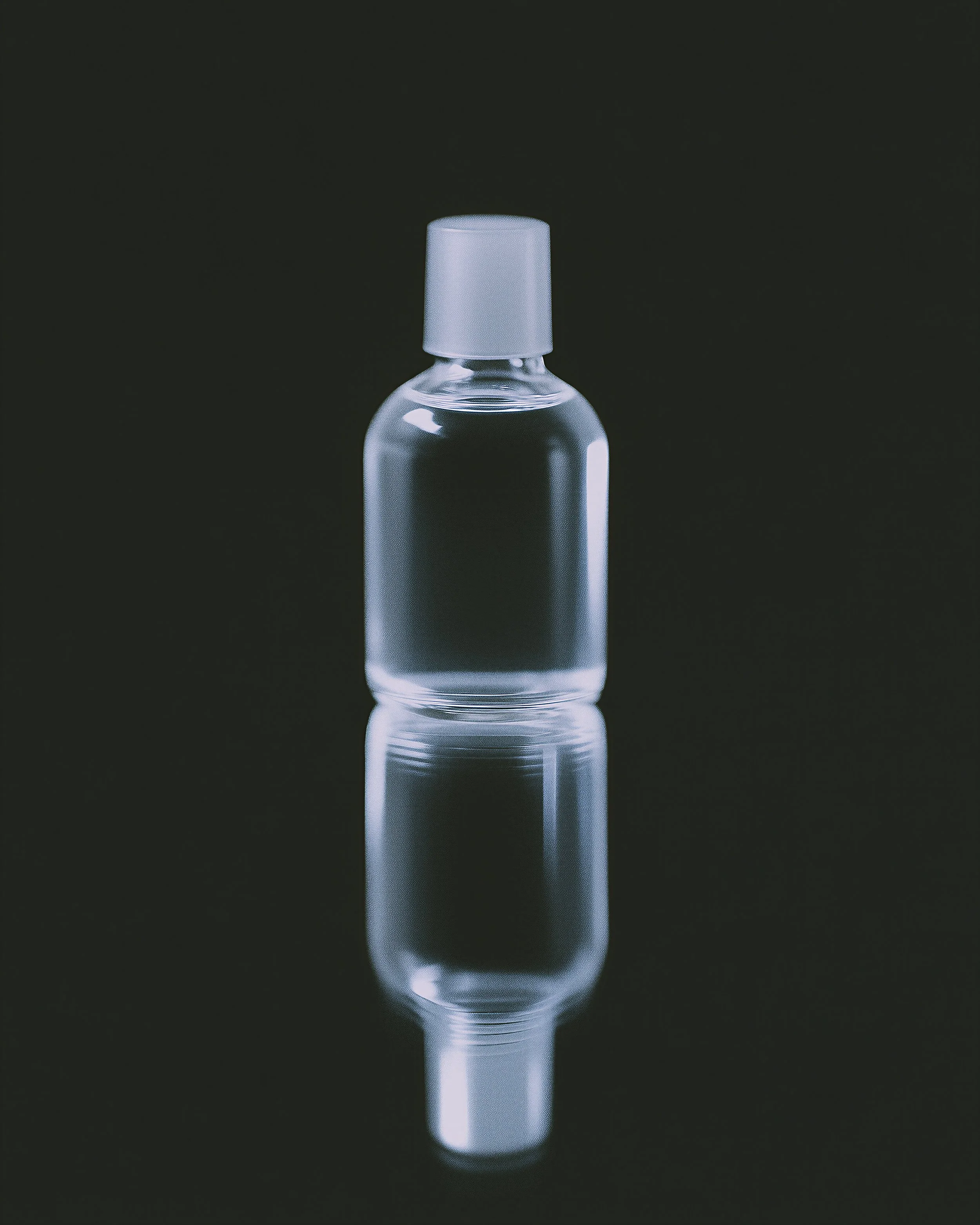
Photography
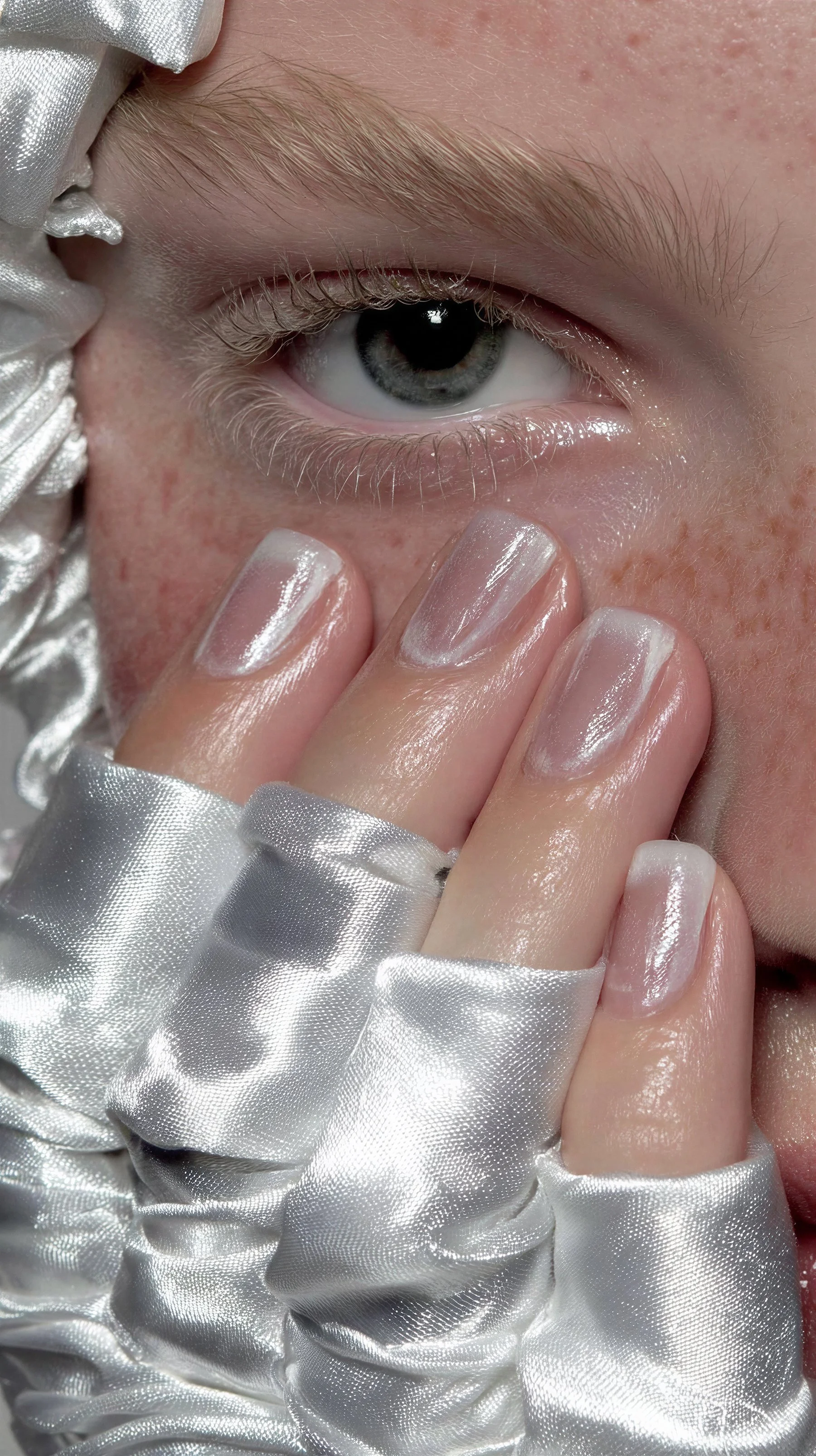
The subject feels nonchalant and free. Crop the portrait tightly around the subject, showing little to no background. If background is shown, use either a monochrome studio backdrop or a natural background.
Portraits
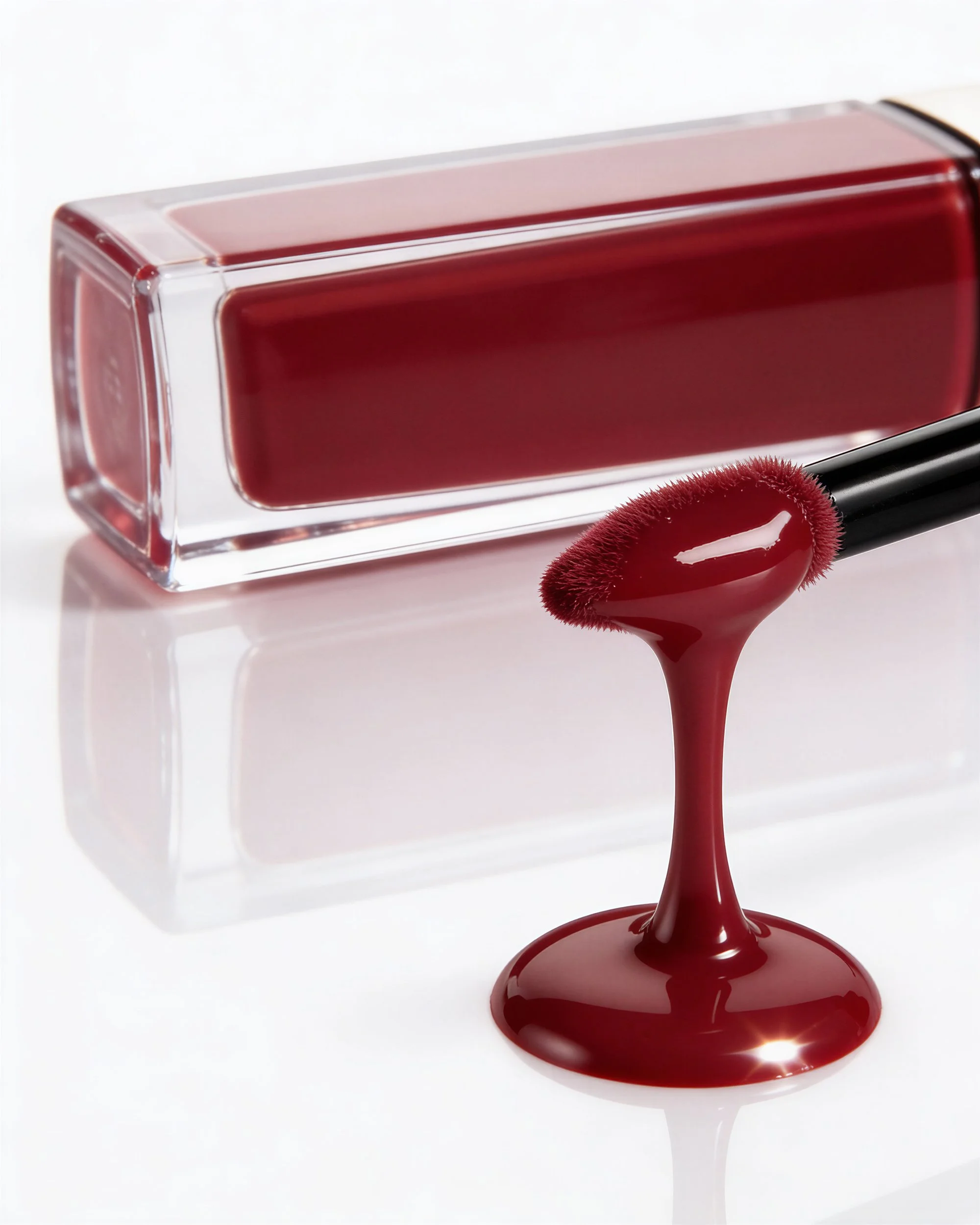
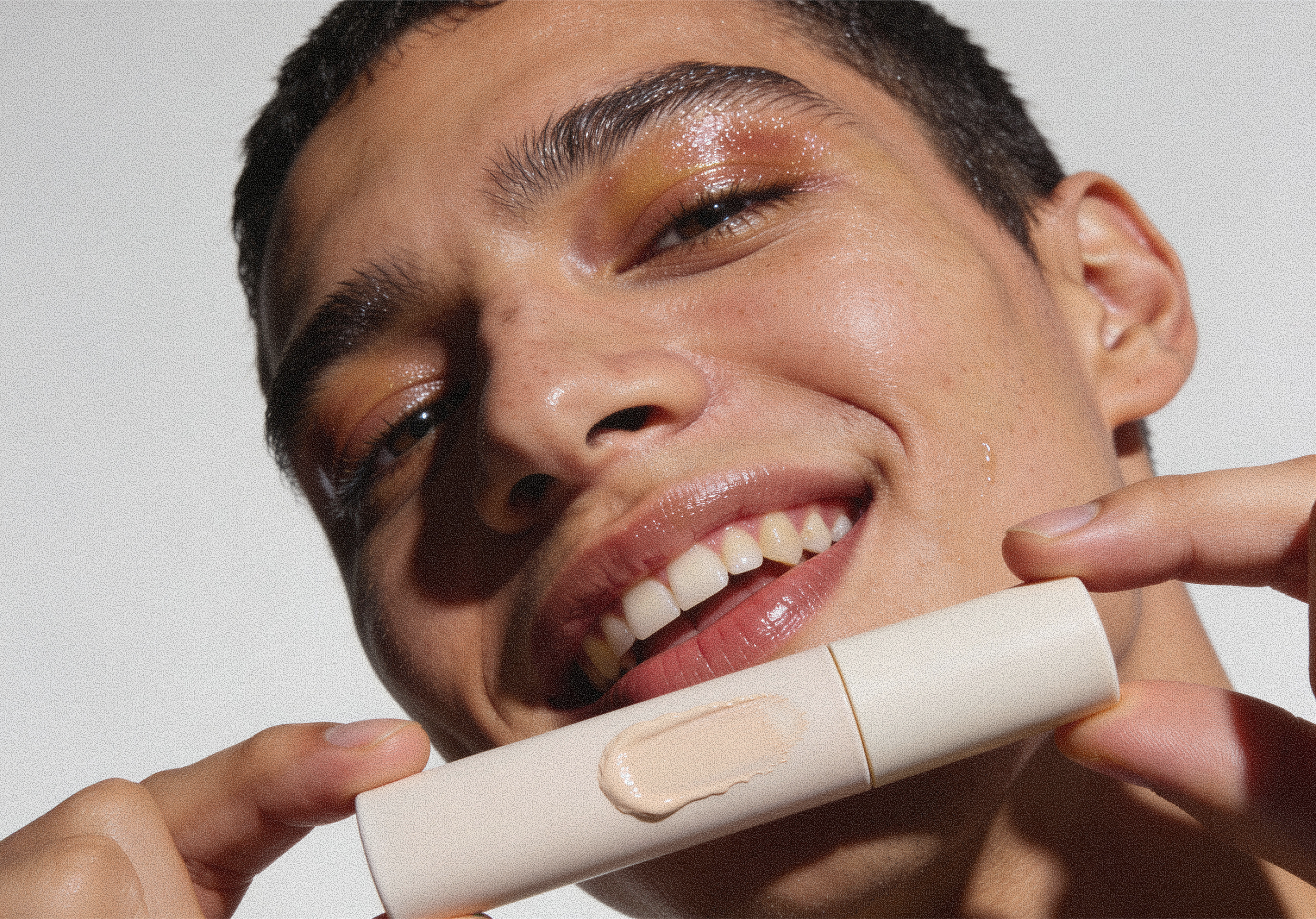
Product Shots: Dark shadows, exaggerating light reflections. Zoom out to show full product packaging on a clean or minimal background. Place objects that reflect the makeup products' color or texture in the frame to help connect customers and the brand.
Product Shots
Product Swatches: Close-up shots of makeup swatches on palettes and skin, emphasizing product and skin texture to represent the rawness and boundlessness of the brand.
Product Swatches