Adobe Life App 5th Anniversary
Campaign Identity / Logo Design / Art Direction+ Role: Graphic Designer & Art Director | Freelance
+ Team: Julia Ip (Product Manager)
+ Date: December 2025
+ Tools: Photoshop, Illustrator and InDesign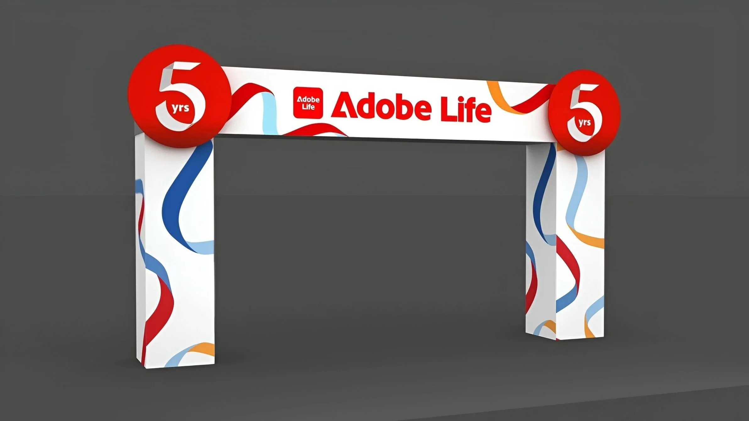
Background
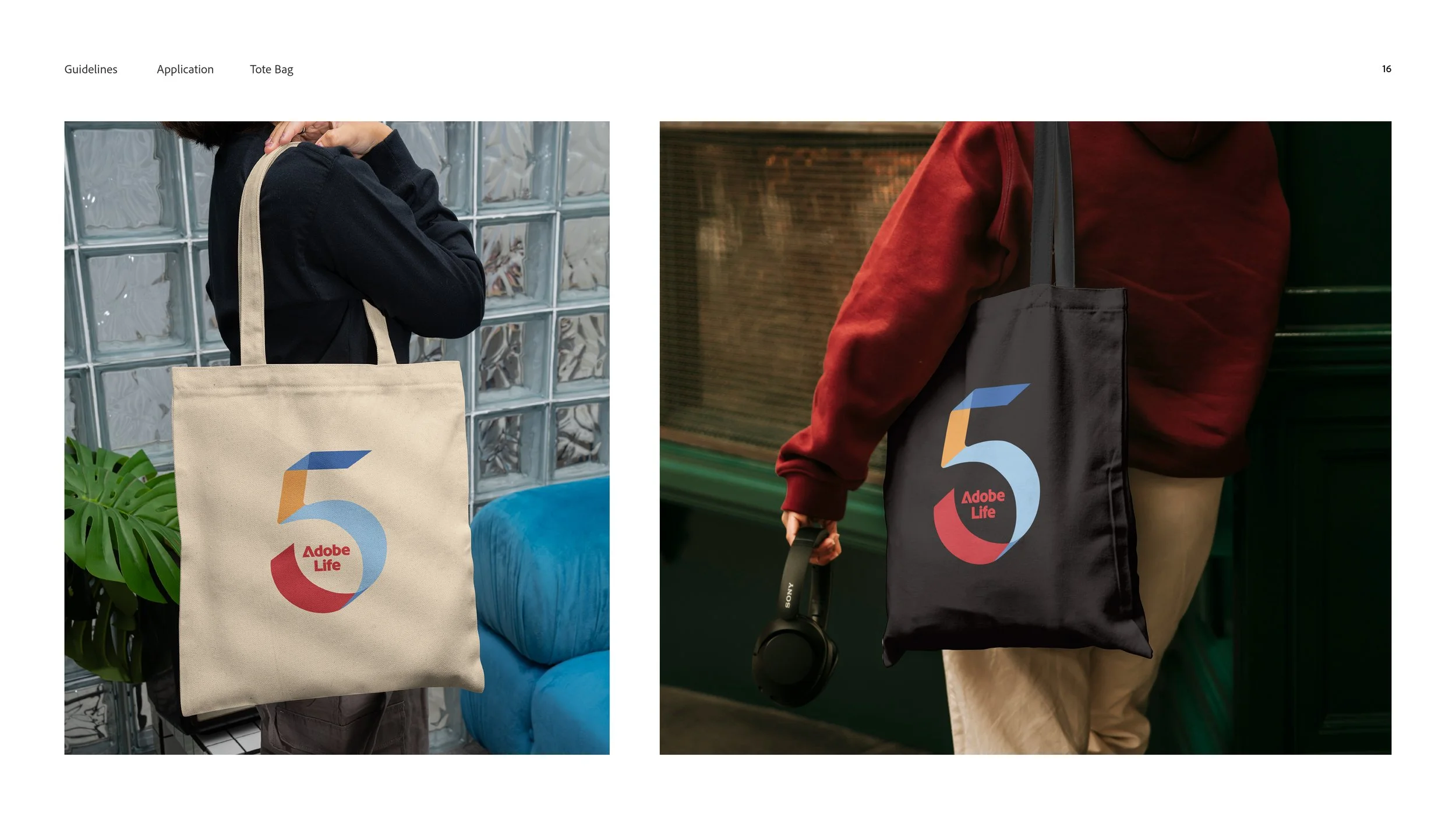
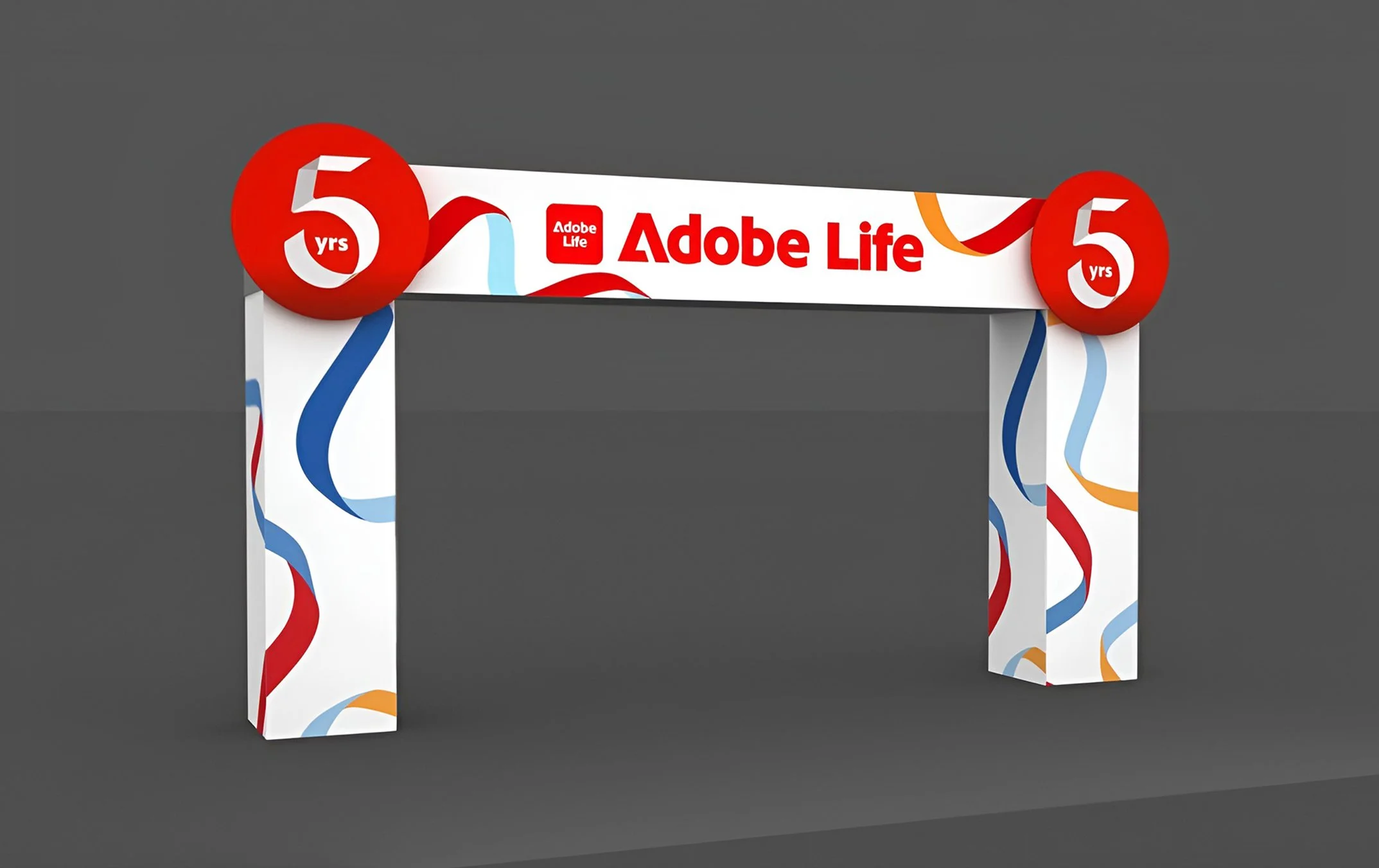
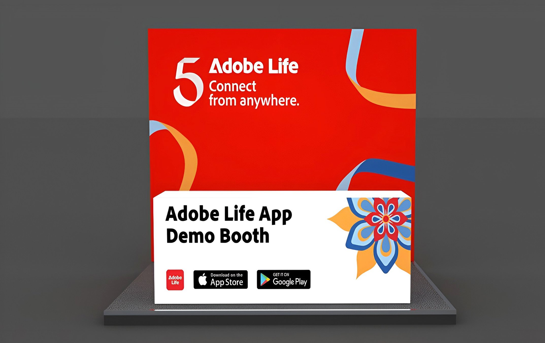
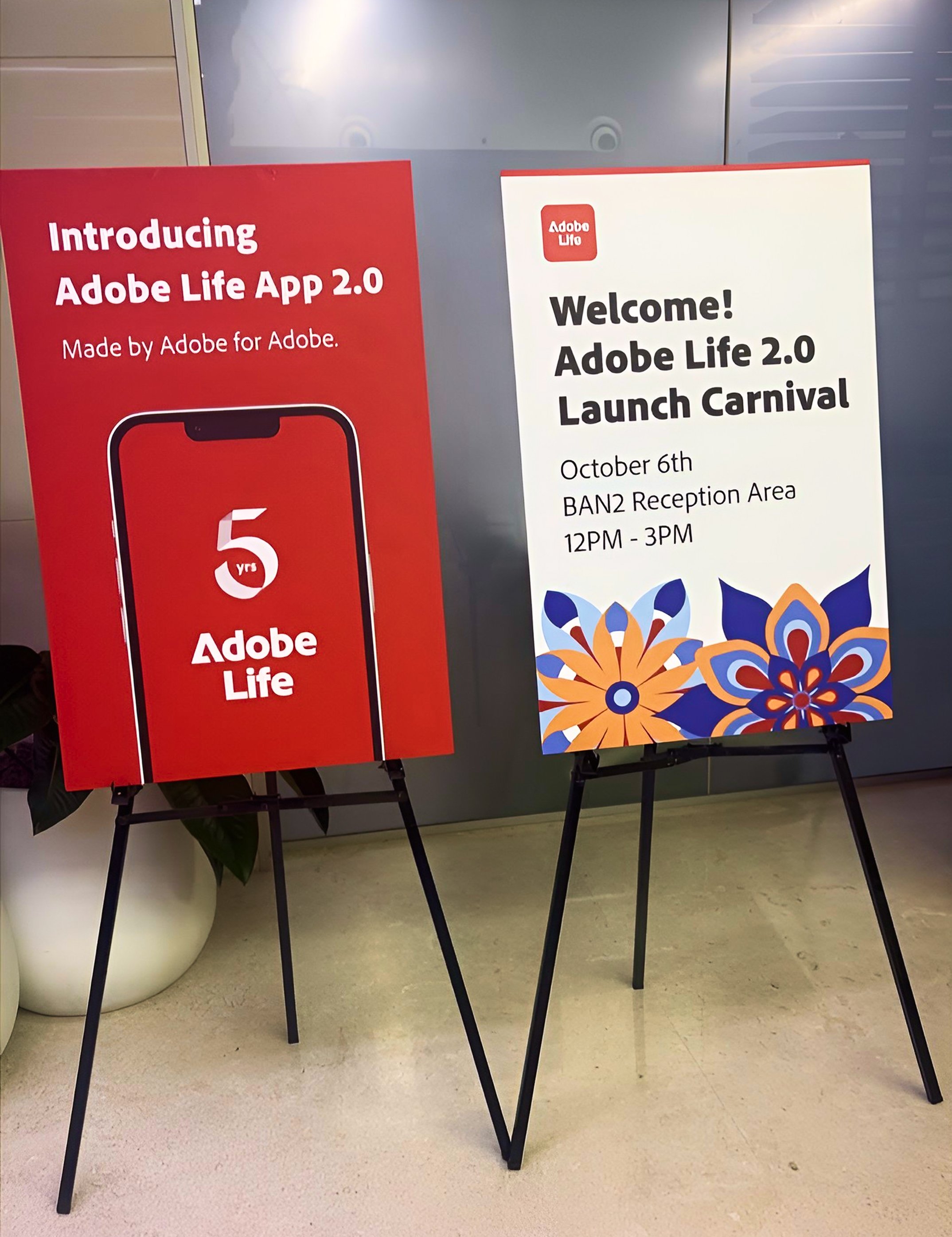
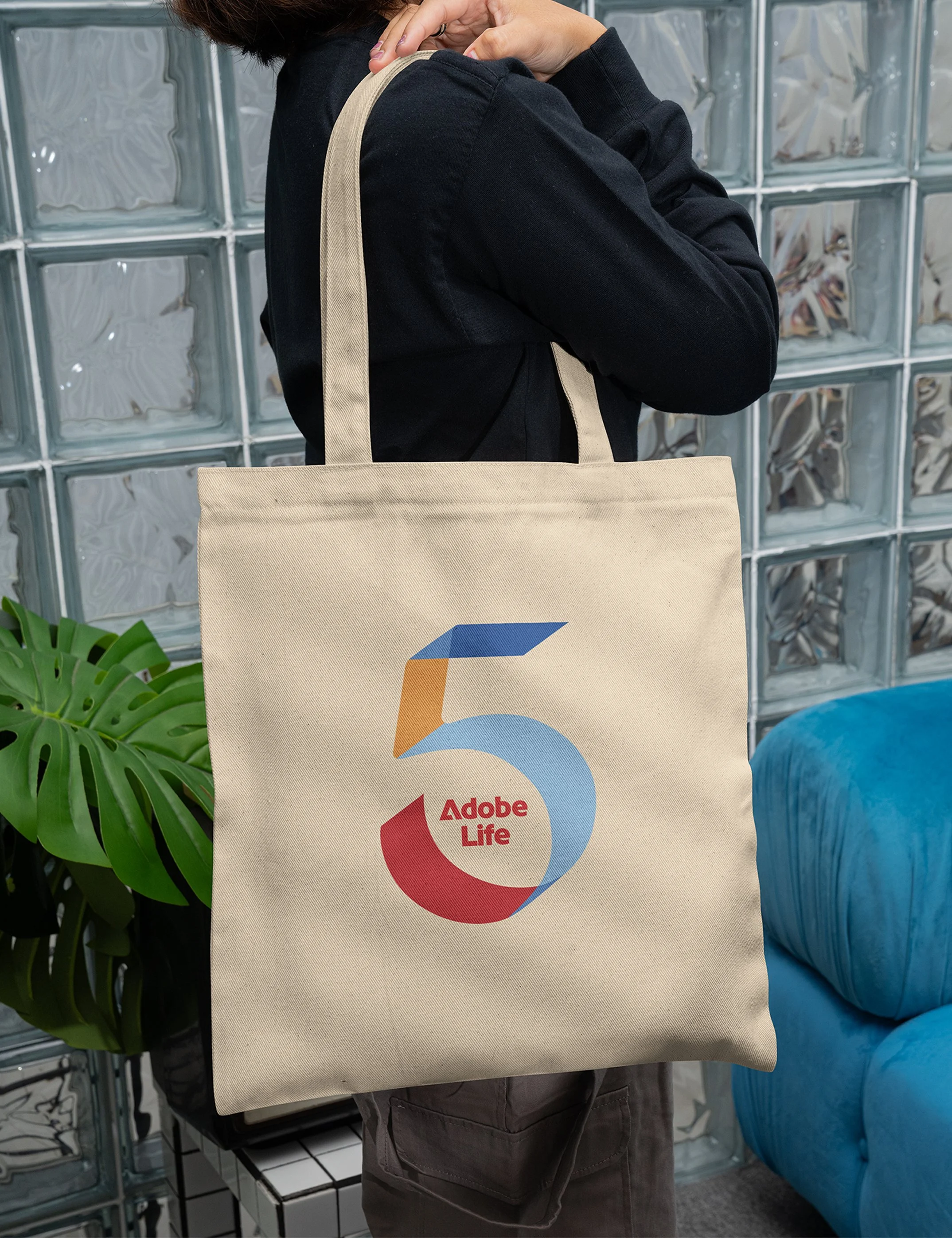
The Adobe Life App asked me to create a campaign identity for their 5th Anniversary and App Relaunch project schedule to launch in 2026. I created a campaign visual identity system that they used on their swag, digital assets and event booth materials.
Research & Direction
Balancing the Adobe corporate branding, The Spectrum, with the department's own distinct identity by visualizing the unique functionalities of the Adobe Life, i.e., connecting its employees and improving on-campus work productivity.
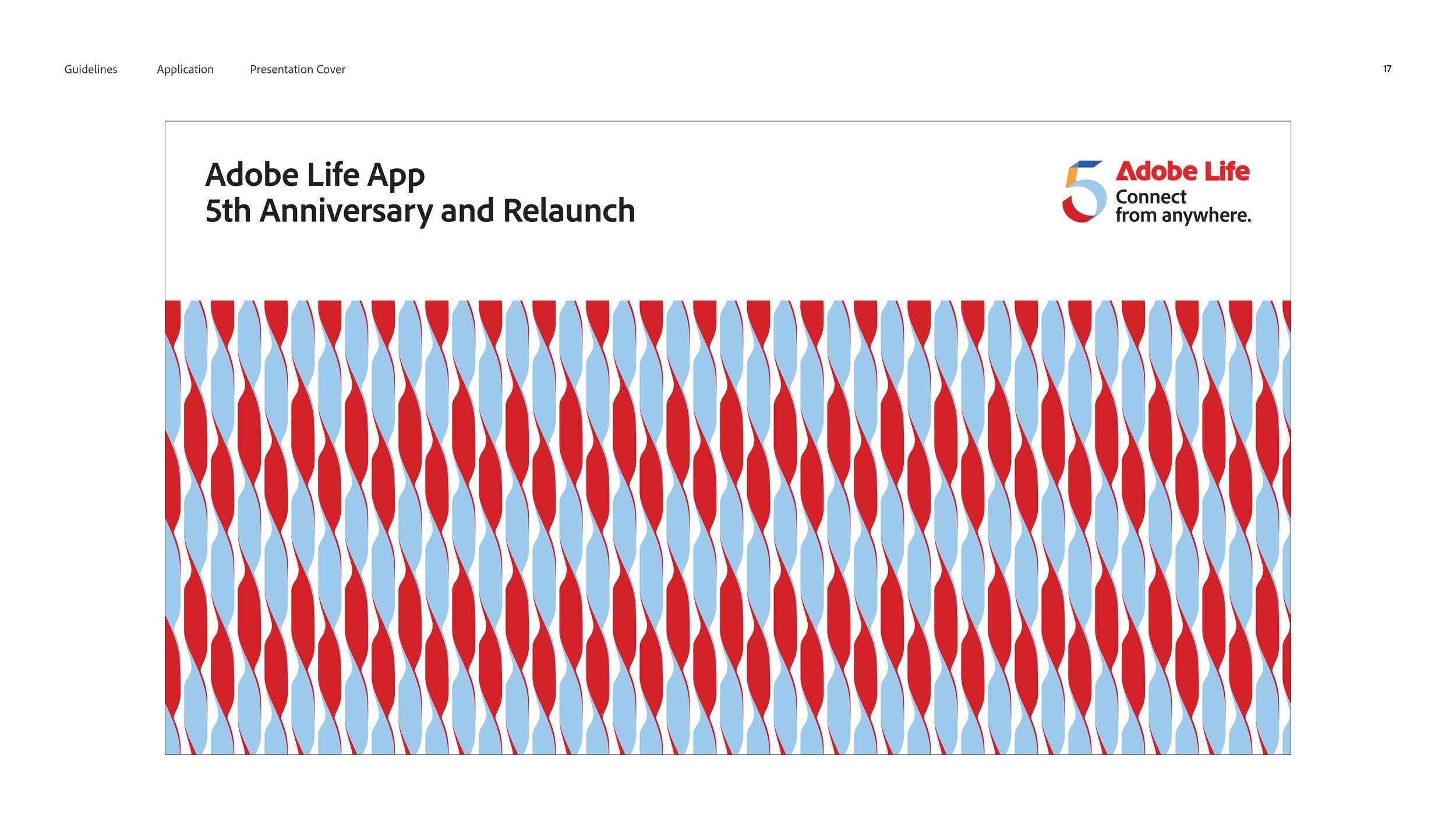
Since there are no past Adobe Life campaign references, I used the company’s annual creative conference, Adobe MAX, campaign visual identities as a starting point for my visual research. I noticed that their identity systems have always featured bright color gradients, eye-catching geometric patterns, and bold image and graphic collages. In the end, I landed on a ribbon-inspired art direction that is vibrant and energetic, but still minimal and clean like the corporate branding.
Design & Rationale
I built an identity system that is versatile for both UX/UI requirements and print & publication needs across touchpoints.
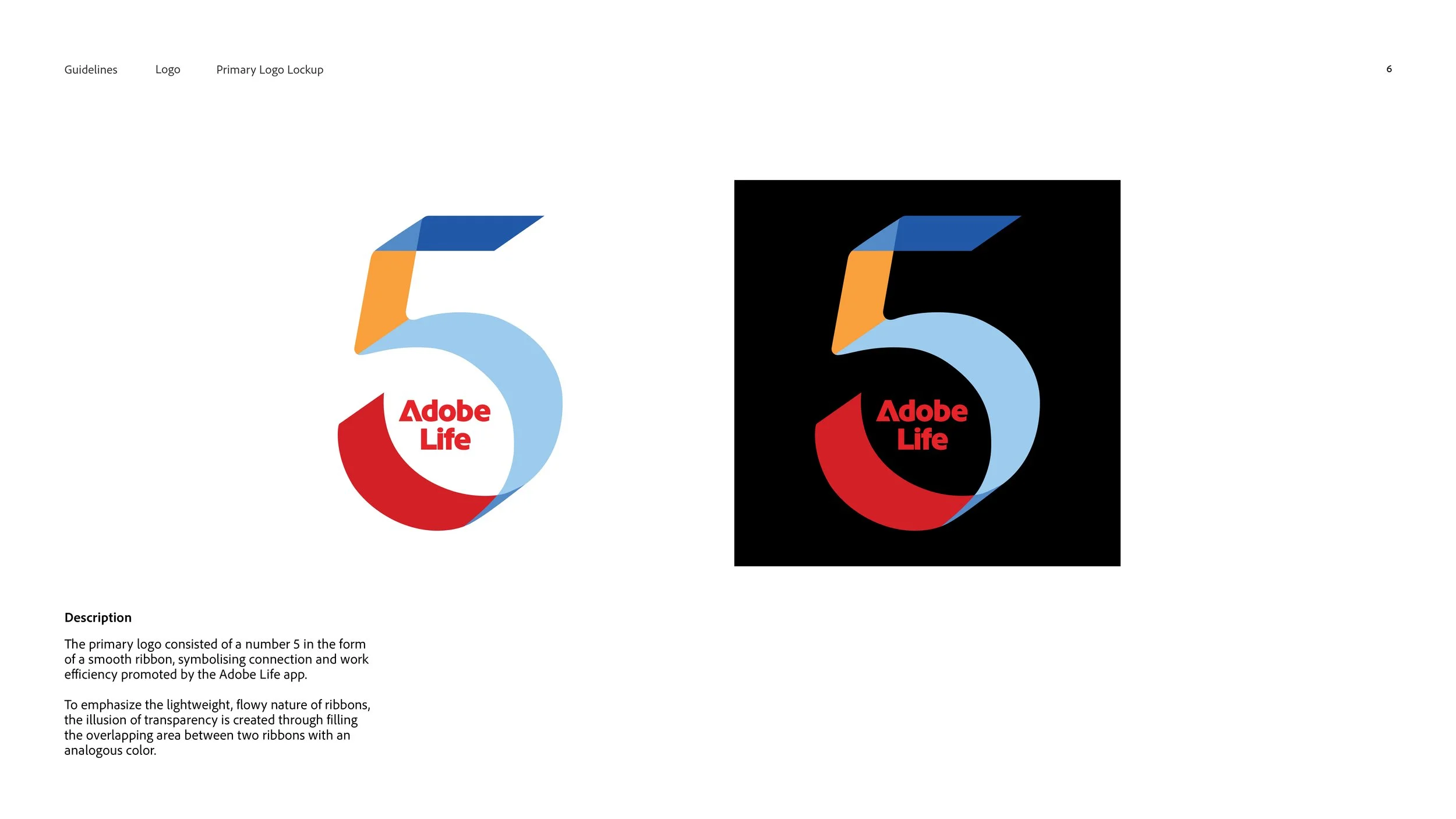
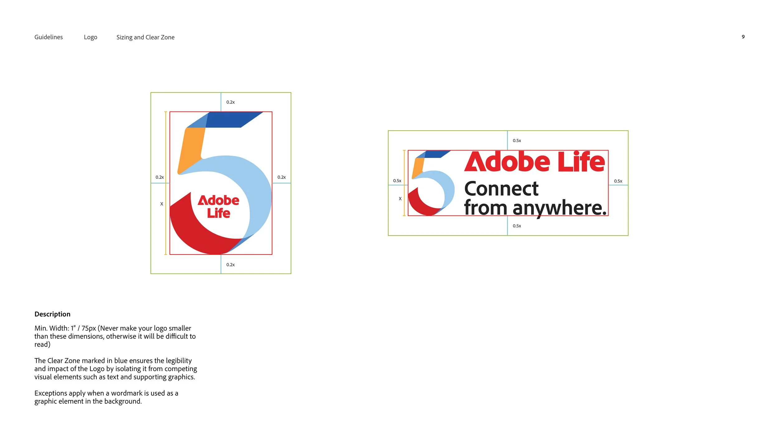
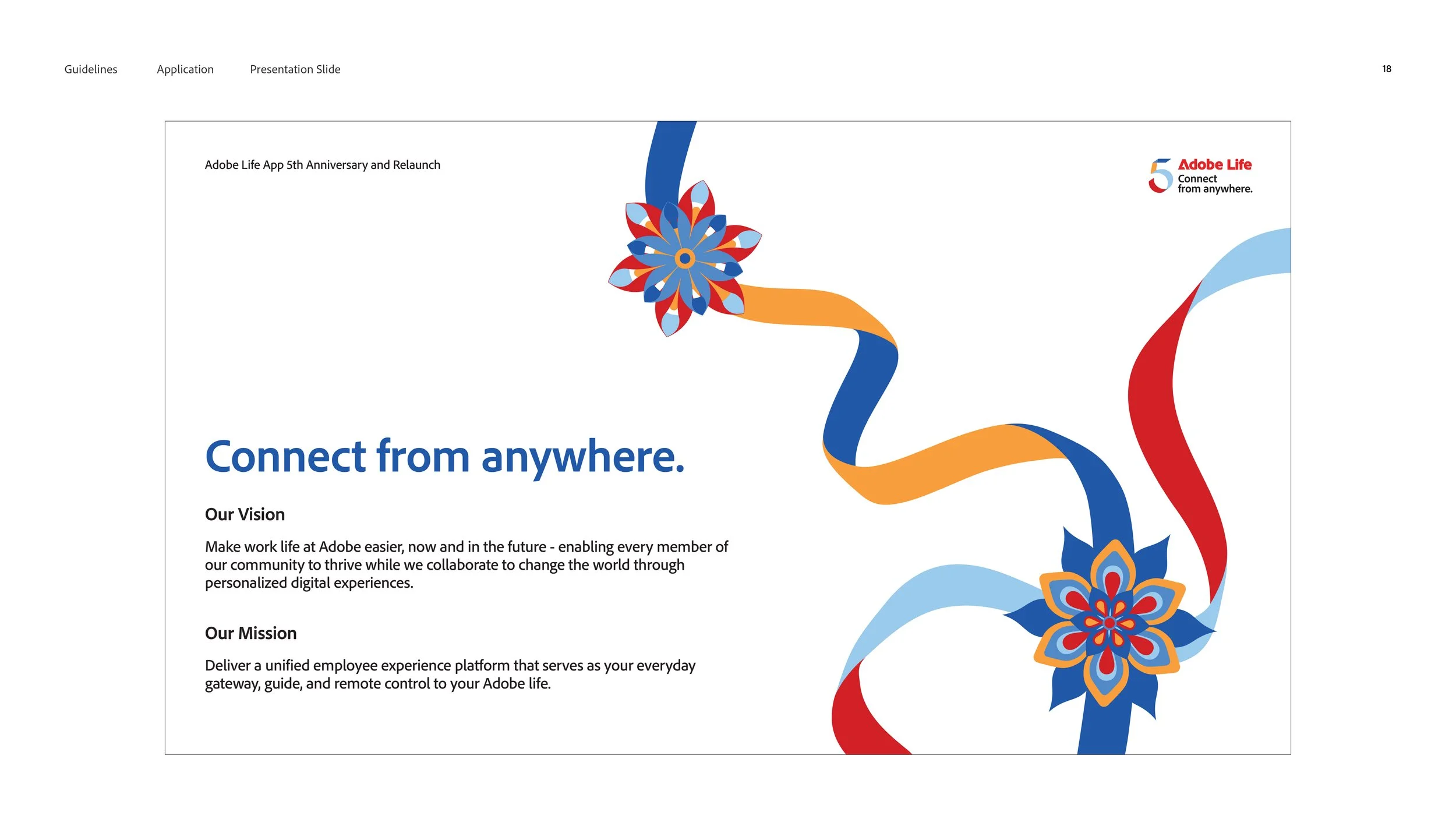
Logo SystemThe primary logo consisted of a number 5 in the form of a smooth ribbon, symbolising connection and work efficiency promoted by the Adobe Life app.
To emphasize the lightweight, flowy nature of ribbons, the illusion of transparency is created through filling the overlapping area between two ribbons with an analogous color.
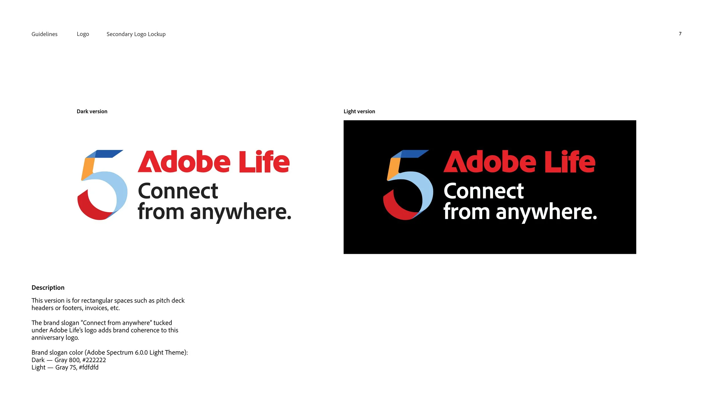
The brand slogan “Connect from anywhere” tucked under Adobe Life’s logo adds brand coherence to this anniversary logo in the secondary logo.
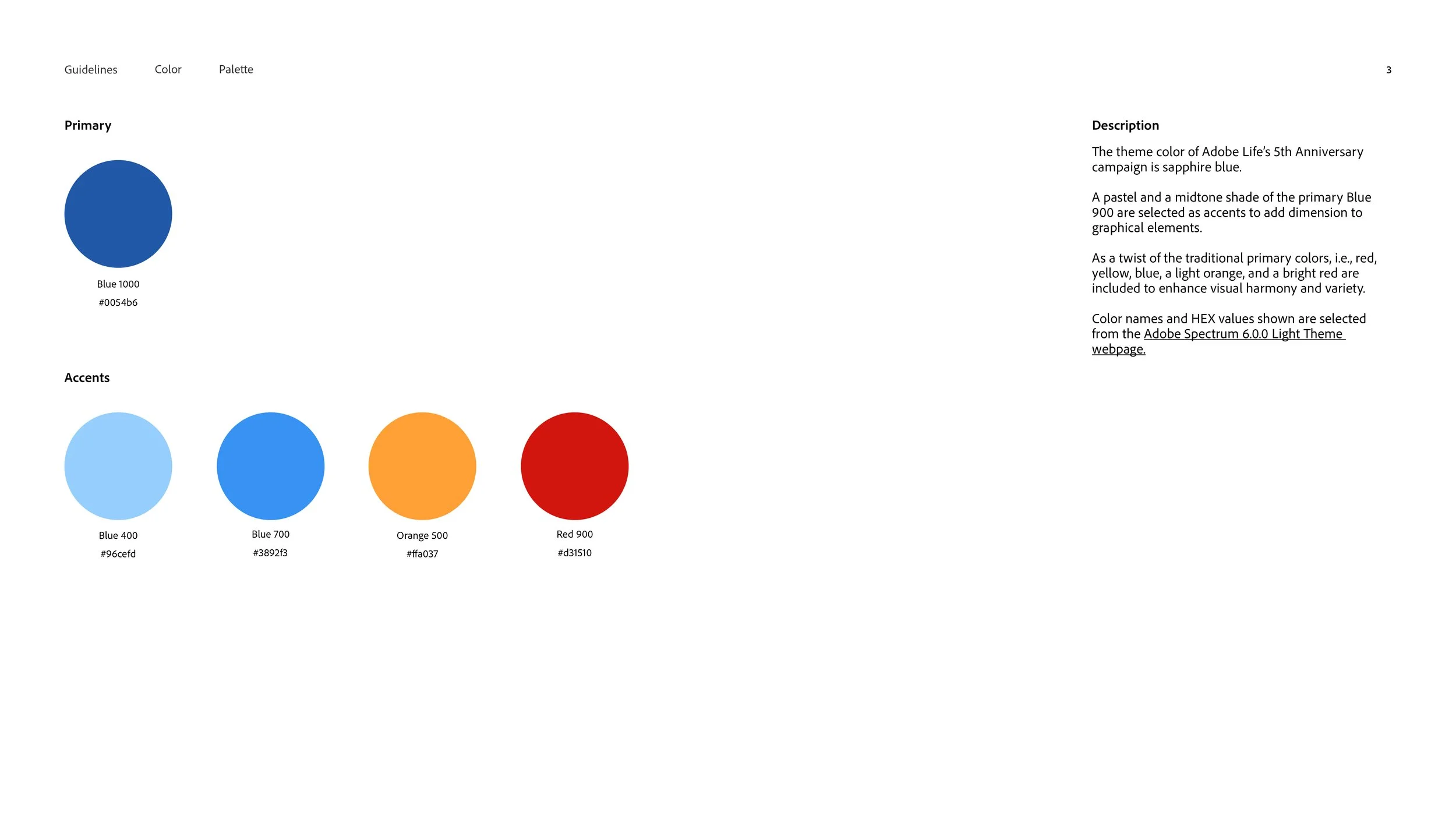
Colour SystemThe theme color of Adobe Life’s 5th Anniversary campaign is sapphire blue. A pastel and a midtone shade of the primary Blue 900 are selected as accents to add dimension to graphical elements.
As a twist of the traditional primary colors, i.e., red, yellow, blue, a light orange, and a bright red are included to enhance visual harmony and variety.
Color names and HEX values shown are selected from the Adobe Spectrum 6.0.0 Light Theme webpage.
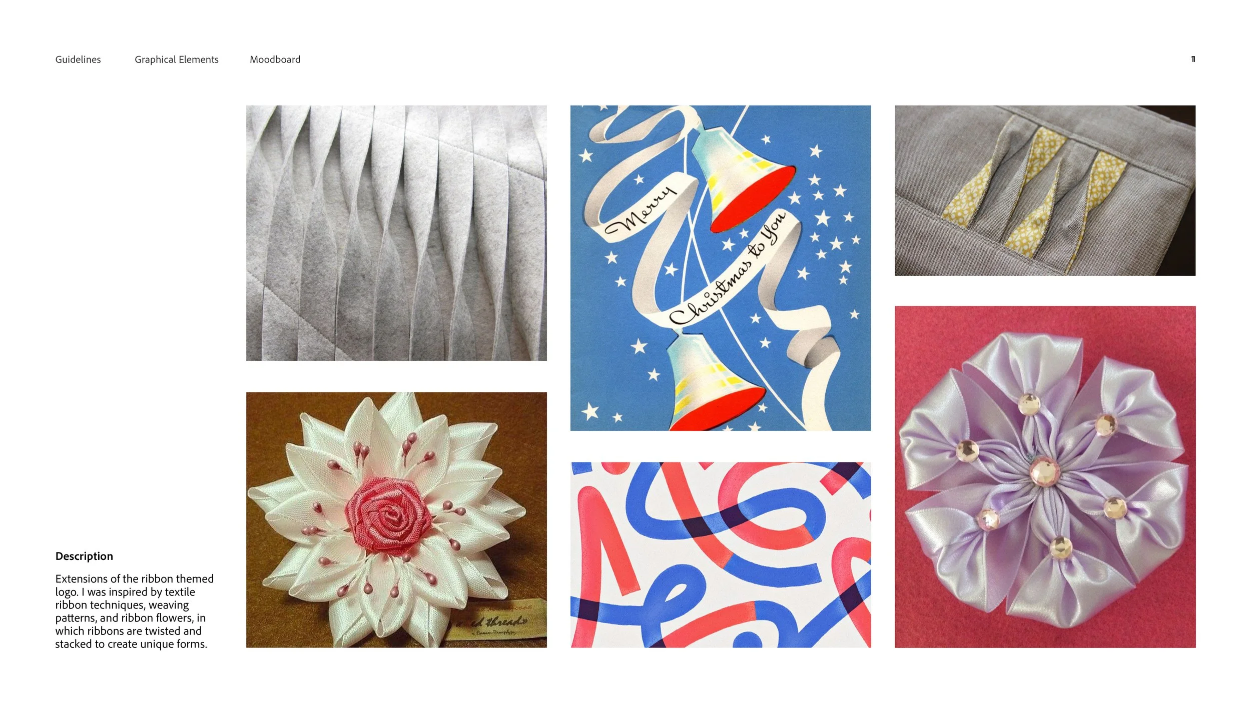
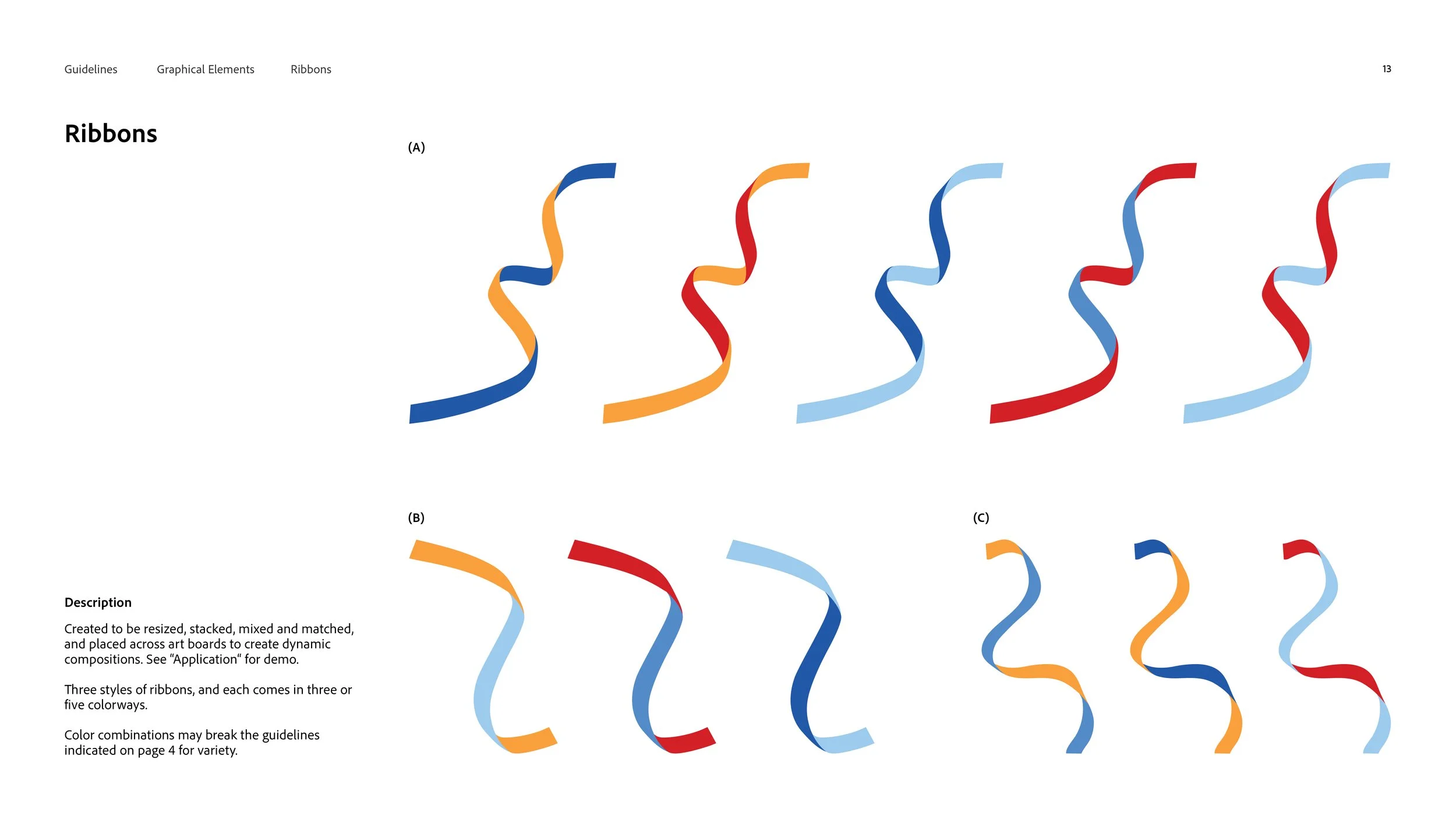
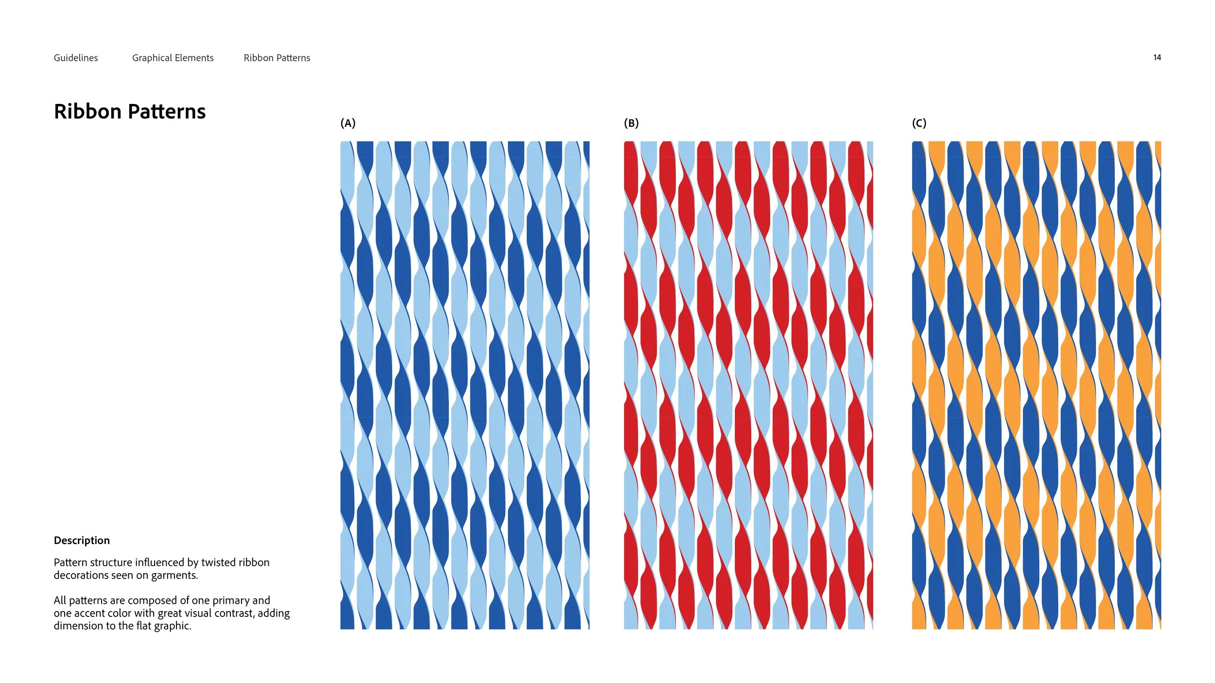
GraphicsExtensions of the ribbon themed logo. I was inspired by textile ribbon techniques, weaving patterns, and ribbon flowers, in which ribbons are twisted and stacked to create unique forms.
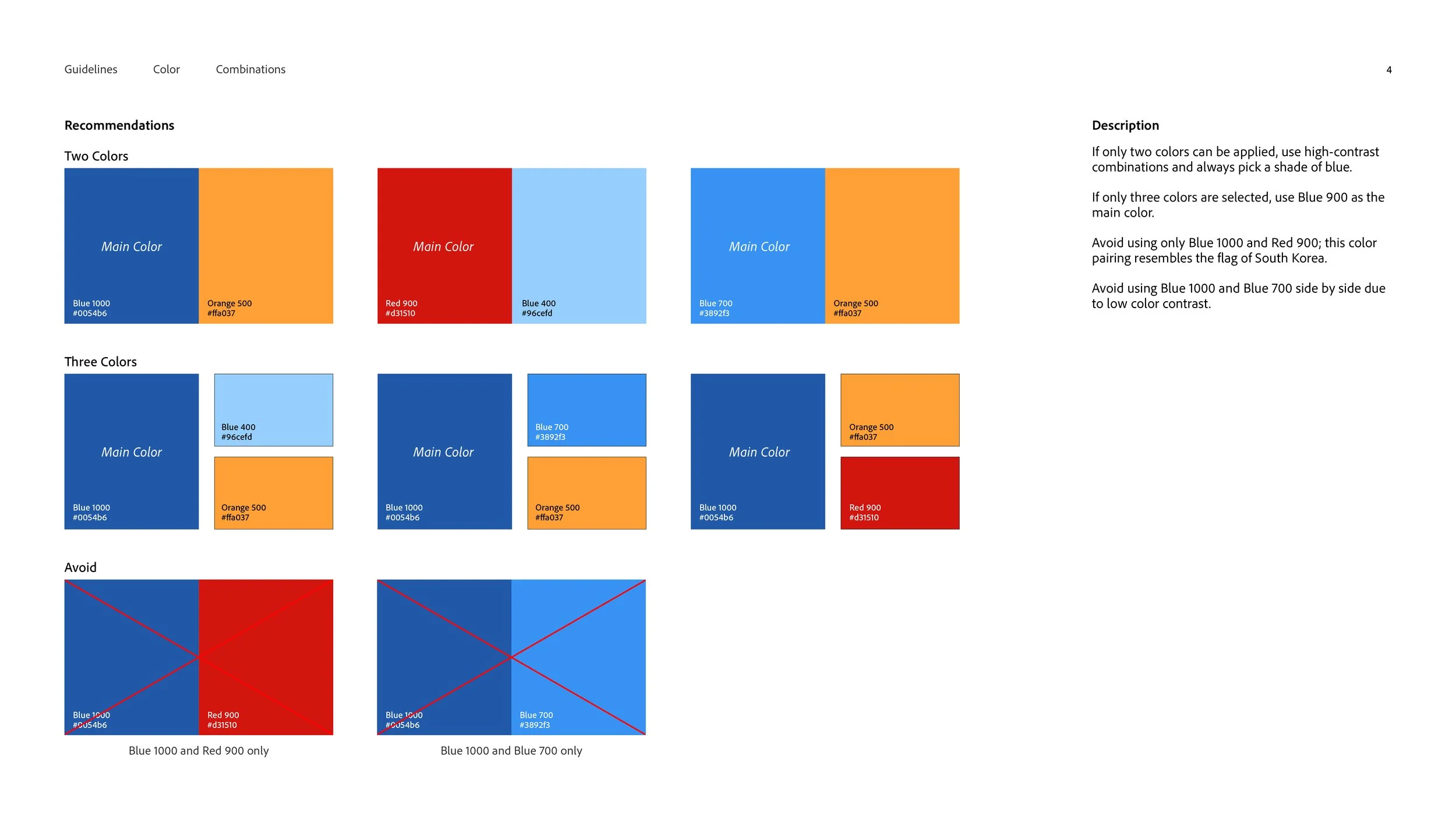
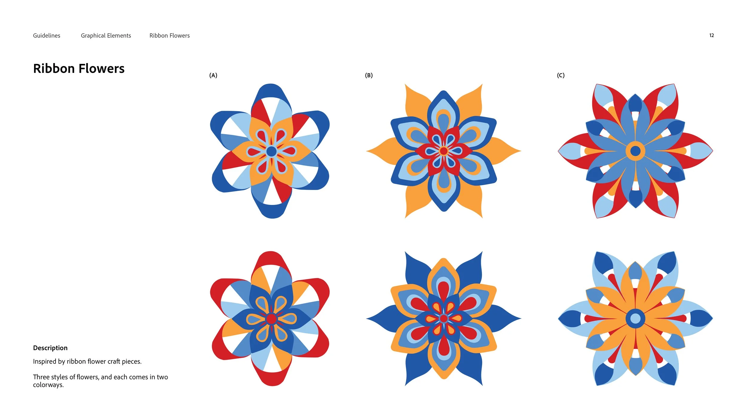
I created 3 styles of ribbon flowers, 3 kinds of ribbons and a background pattern in various colour ways, which also act as guidelines on colour combinations do’s and don’ts.
Outcome
In three weeks, I delivered the full visual identity system. I worked closely with Julia Ip, Product Manager, throughout the process.
Testimonial by Julia:
“Charlotte’s designs were crucial for helping to craft our app’s identity for our relaunch. We were able to use the logo and assets she created for our swag, presentations, and event branding. Charlotte was very easy to work with and produced high quality designs!”

Visual Identity Guidelines