Gaudy
Brand Identity / Art Direction 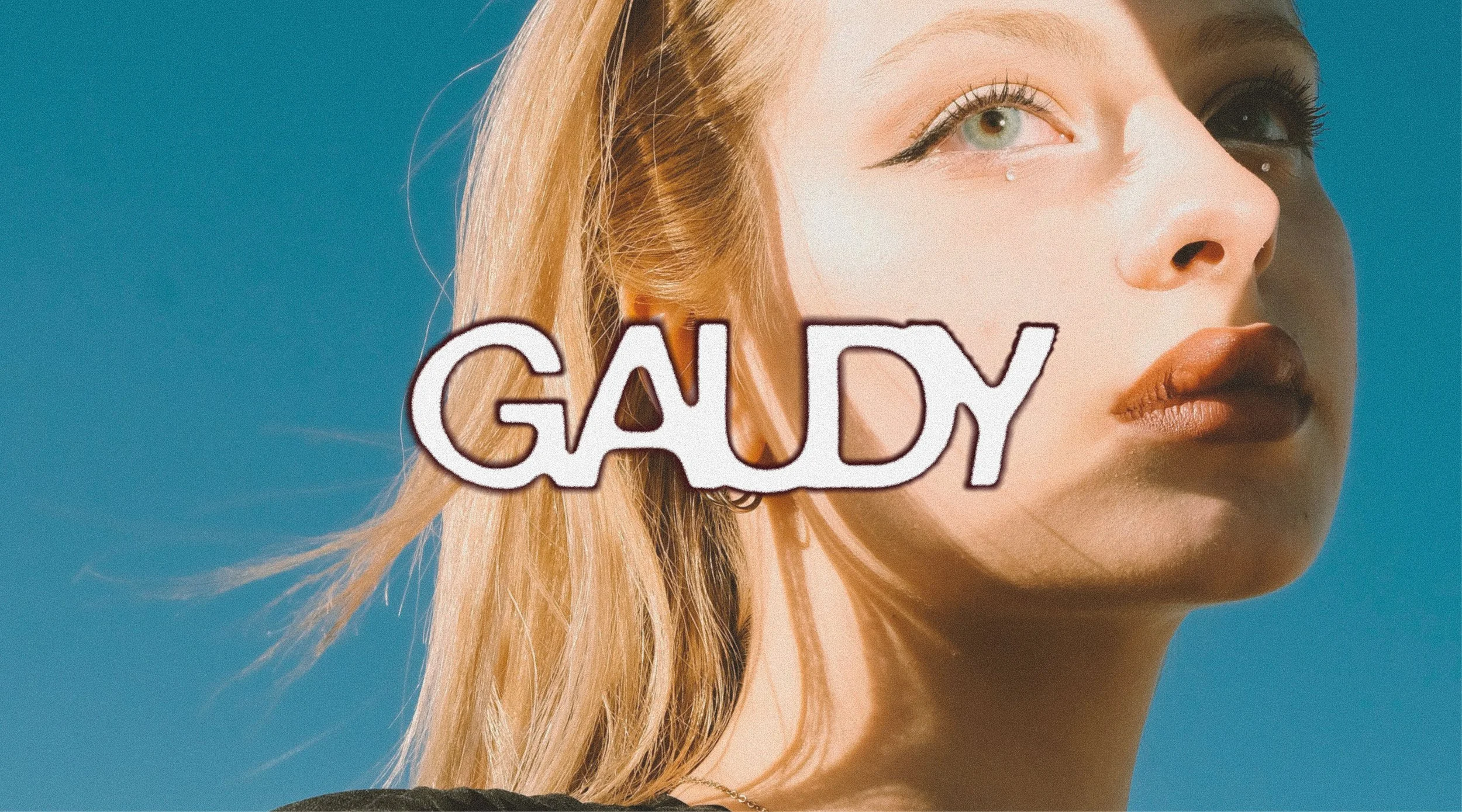
Overview
I created a new brand identity for the cosmetic brand Gaudy. We recognise the need for a gender-neutral beauty brand that balances playfulness, professionalism, and luxury. I developed a flexible visual identity system that sets Gaudy apart through their distinctive photography, digital assets, and packaging that evolve with the brand.
Research & Direction
While conducting market research, I discovered that most mainstream professional cosmetic brands’ visual identities are black-and-white themed and feel less personal. Customers might struggle to differentiate these brands and could find it hard to resonate with these over-minimalised brand stories.
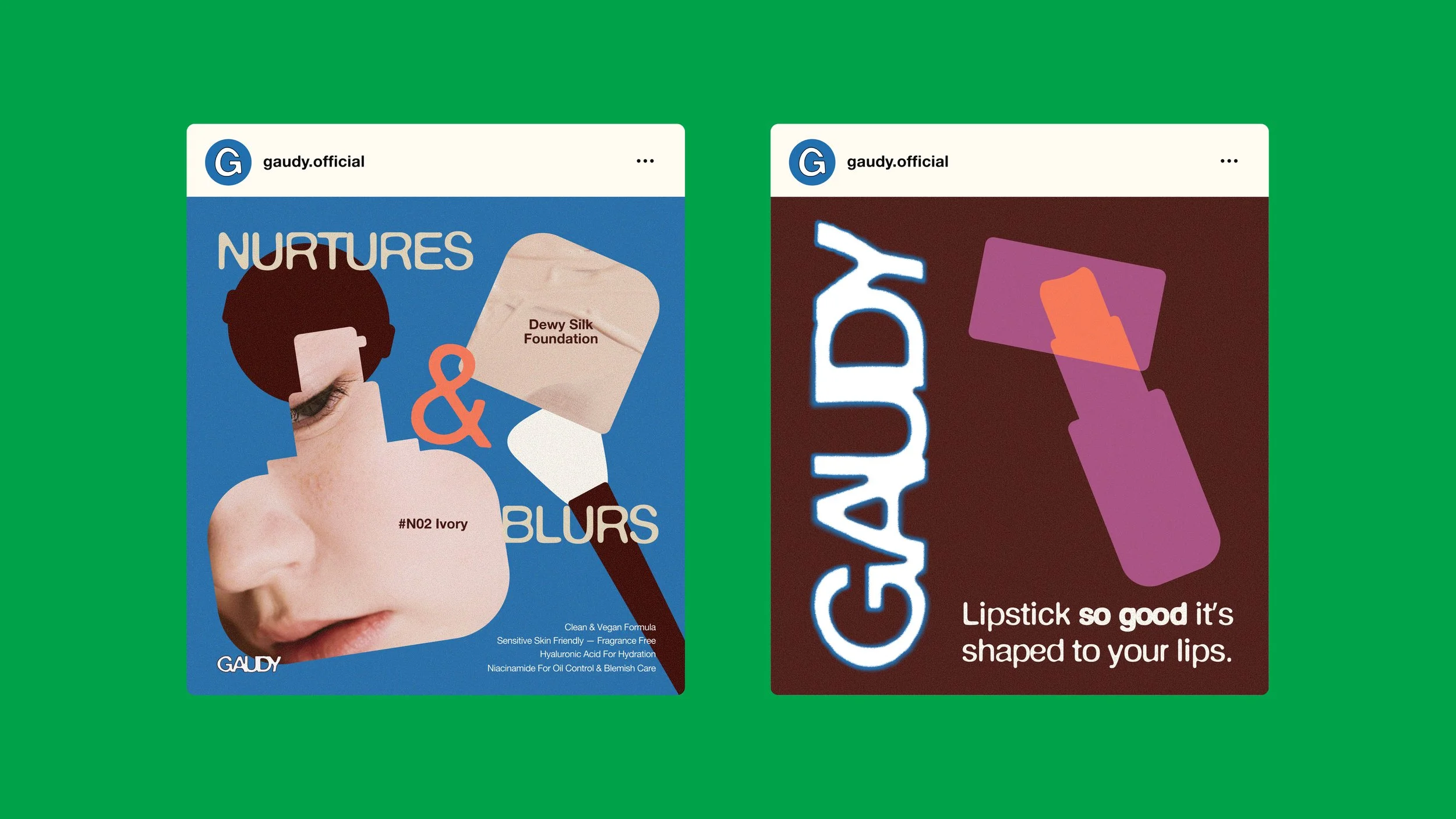
I decided to create a visual identity system that strikes a balance between gender neutrality and playfulness by the use of a sophisticated colour system, sticker-like graphic cut-outs of makeup items, and a straightforward copywriting style to add a personal touch to this professional-grade makeup brand. The new brand visual language system enables the brand to achieve its mission of blurring the line between cosmetics and gender while encouraging consumers to unleash their creativity through makeup.
+ Role: Graphic Designer | Passion Project
+ Date: September 2025
+ Tools: Photoshop, Illustrator, Figma, Lummi and Pexels Stock
Design & Rationale
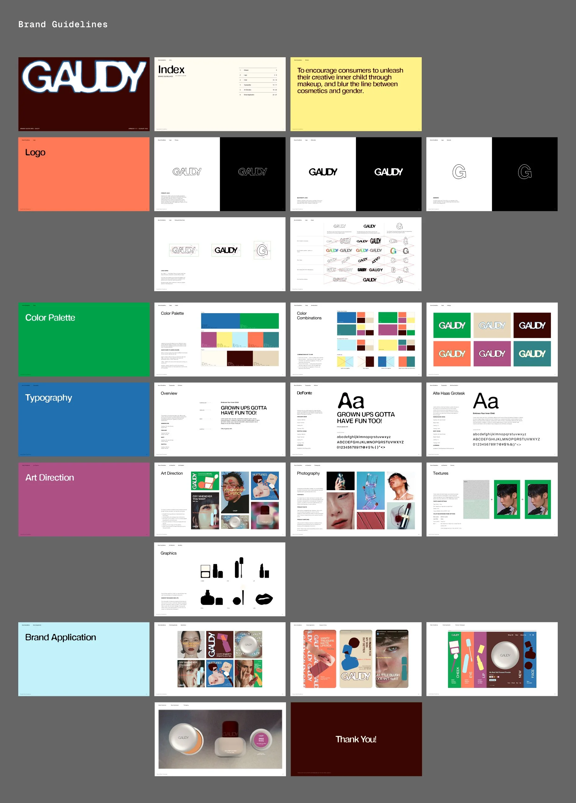
Logo SystemI designed a logo system that presents the brand name in a molten form with a slight fisheye distortion, reflecting the brand's mission to foster a sense of eagerness to break free from social and gender stereotypes in cosmetics.
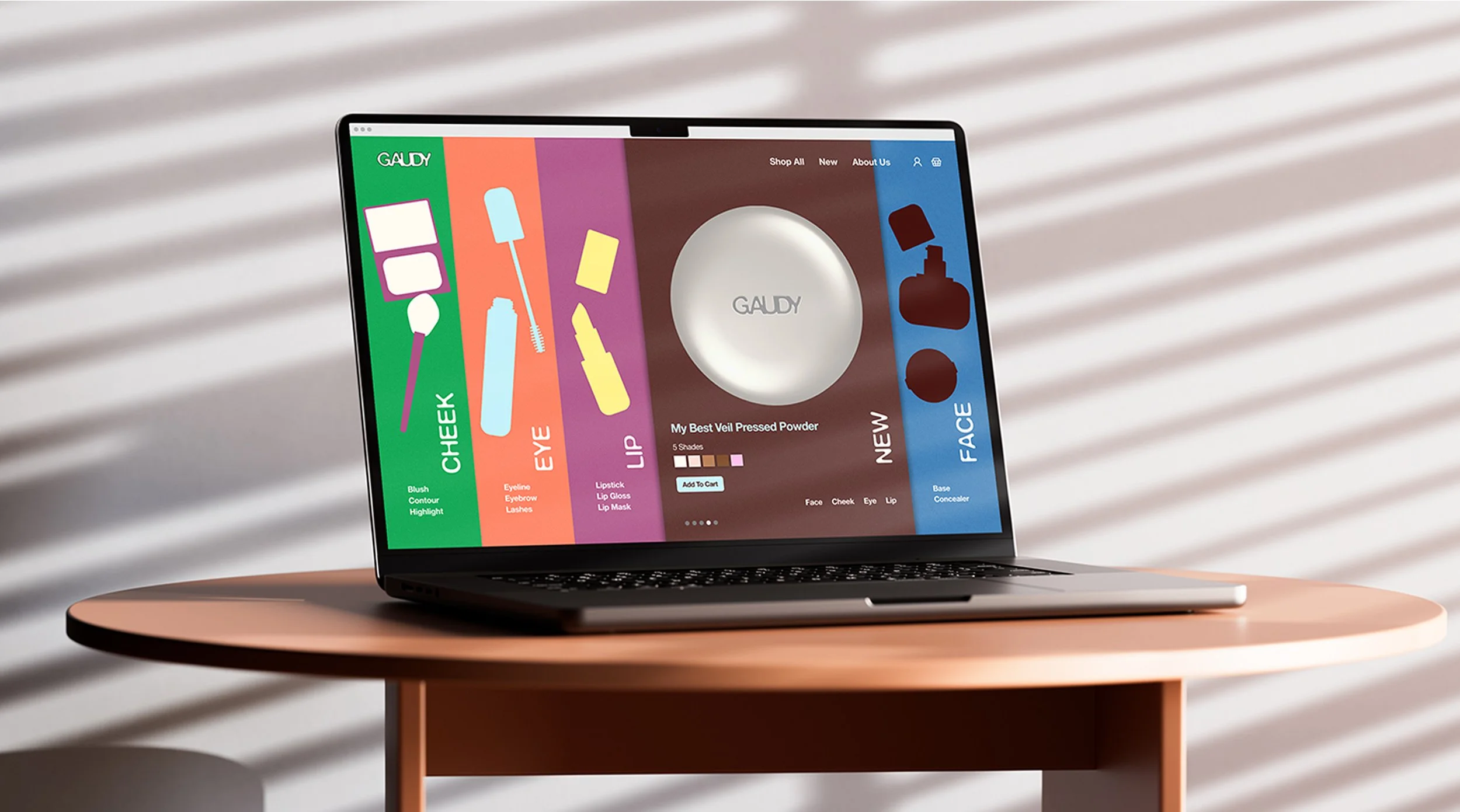
I built a modular brand system applicable across marketing channels, including social media, packaging, website, and ad campaigns.
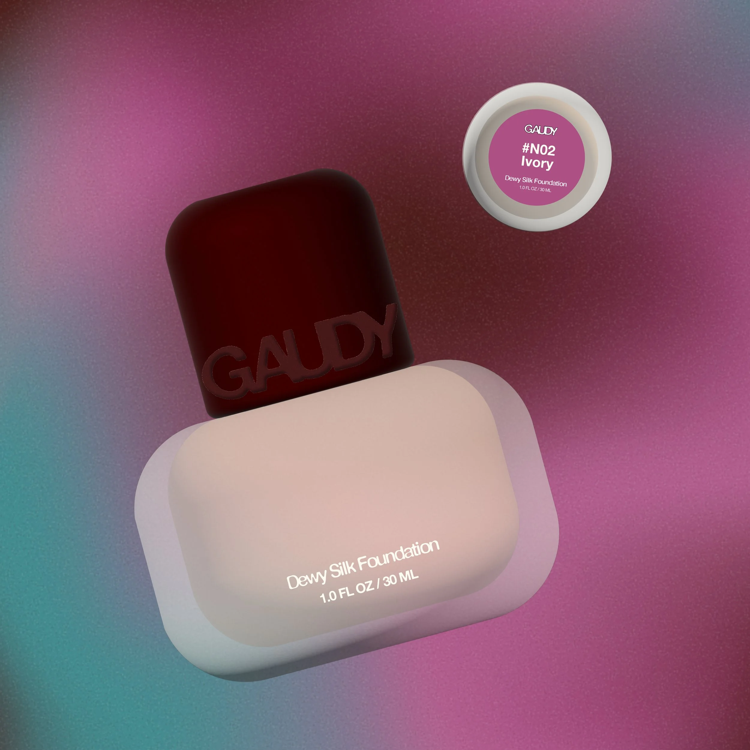
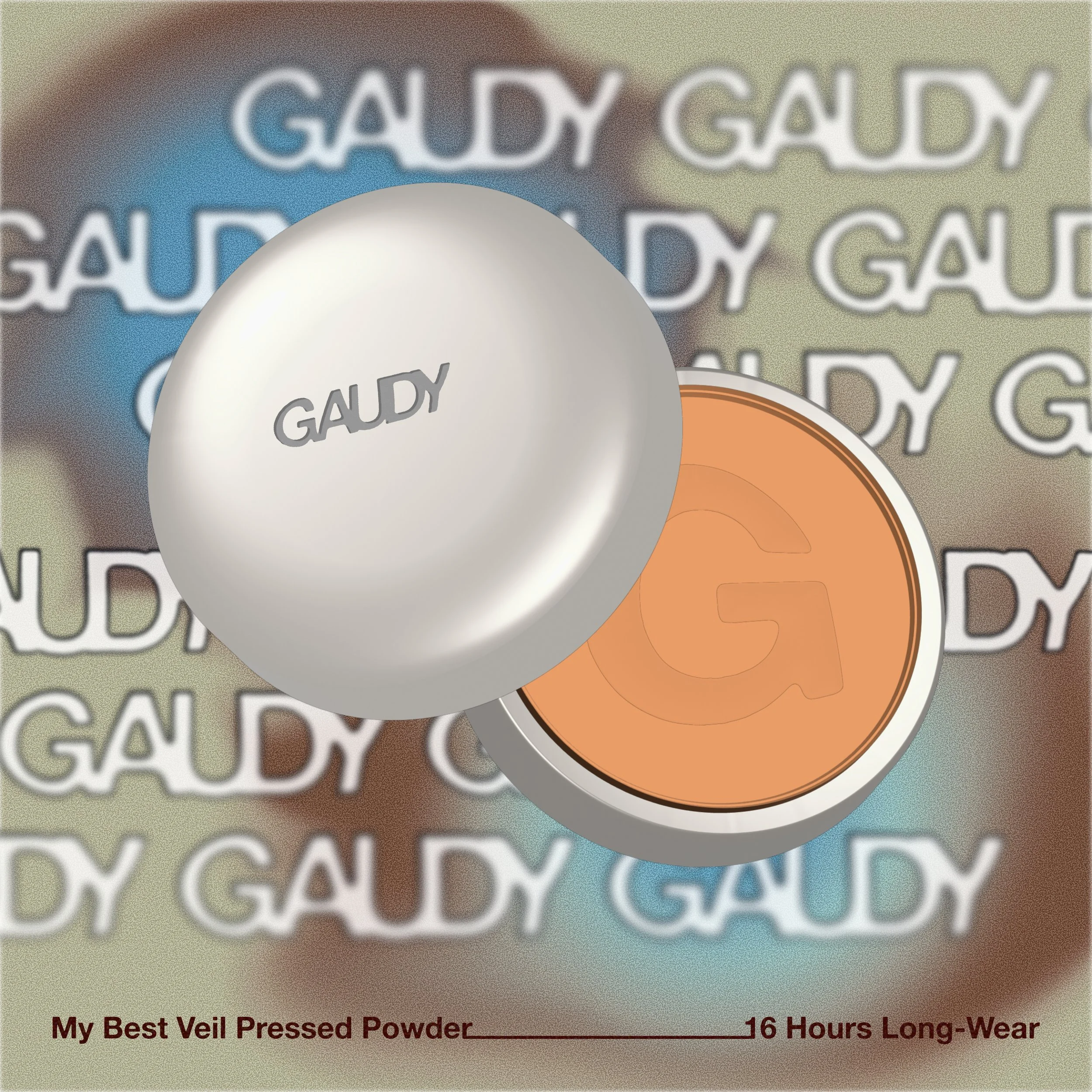
Colour SystemThe brand colour system is a toned-down adaptation of the kitsch Memphis Group color palette of vibrant yellow, purple, blue, and pink, which embodies Gaudy’s adventurous yet down-to-earth brand values.
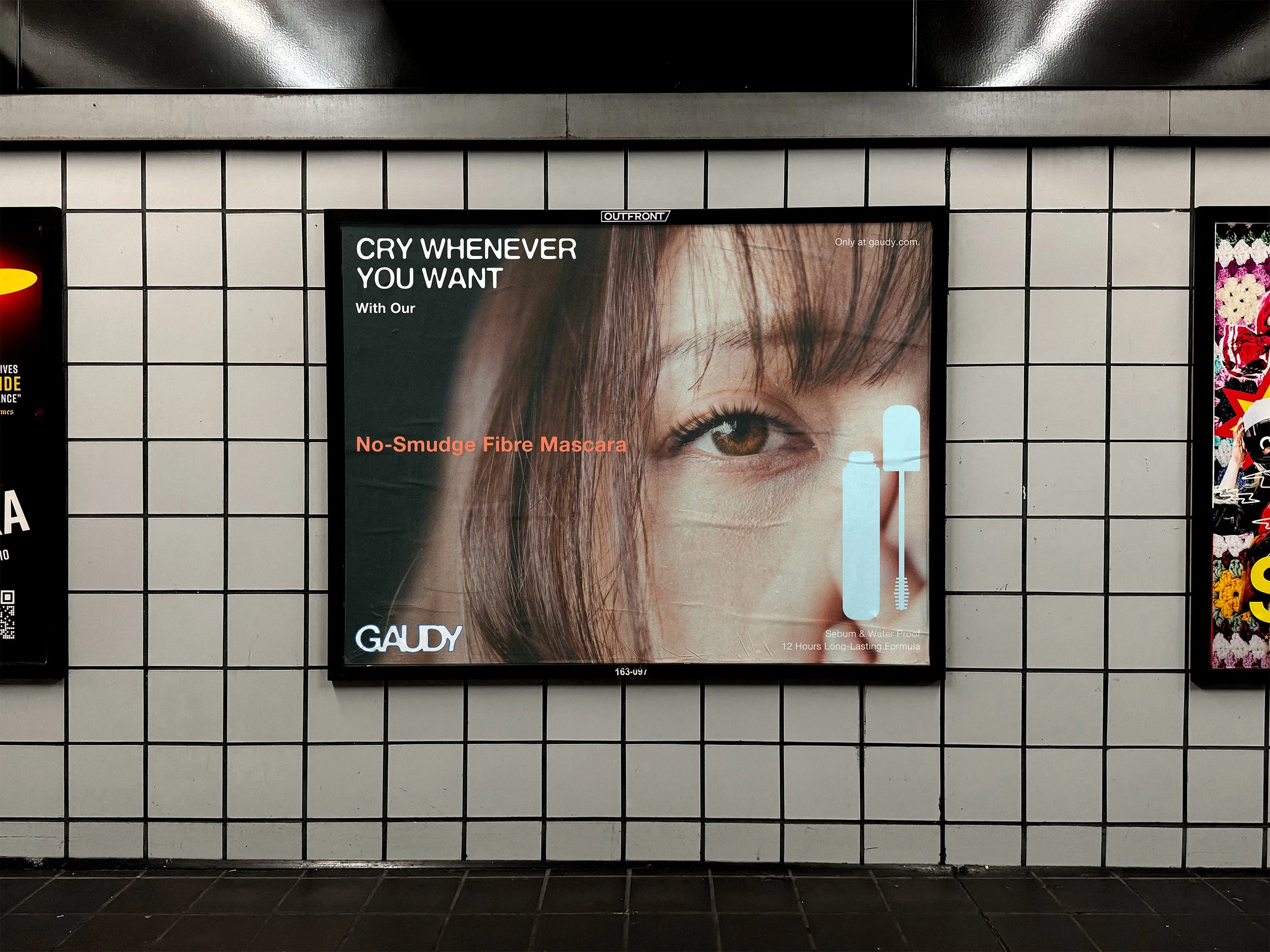
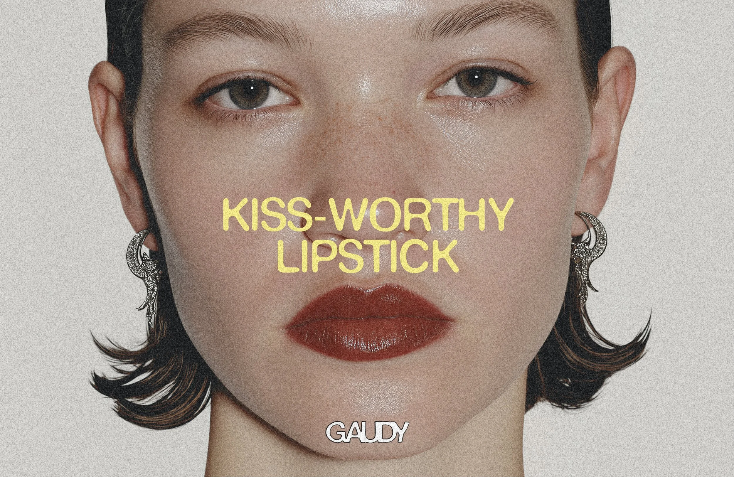
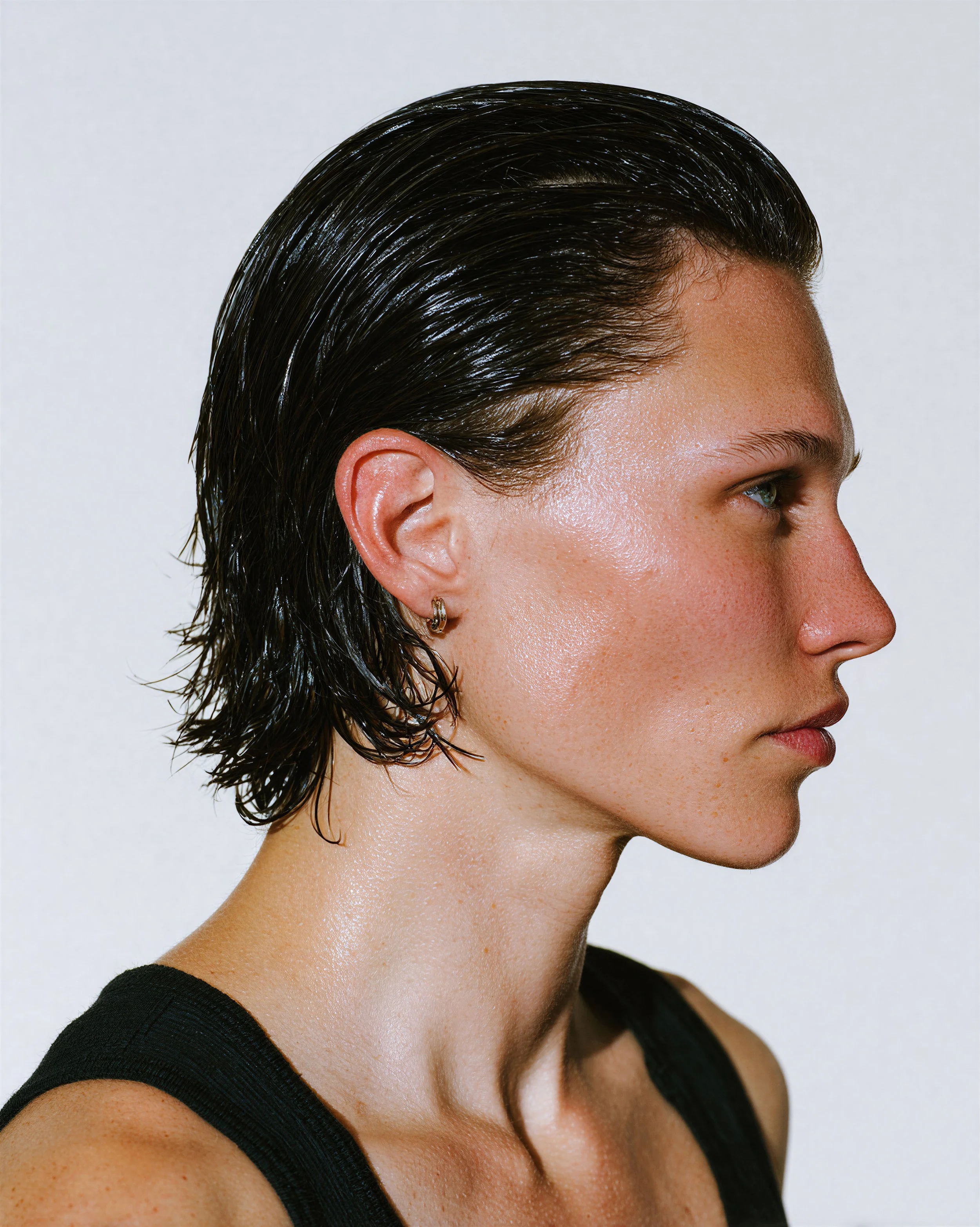
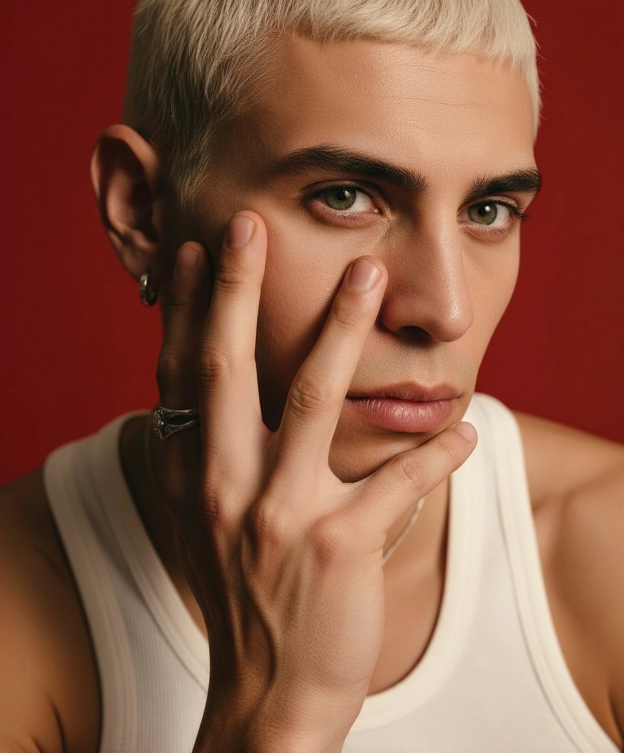
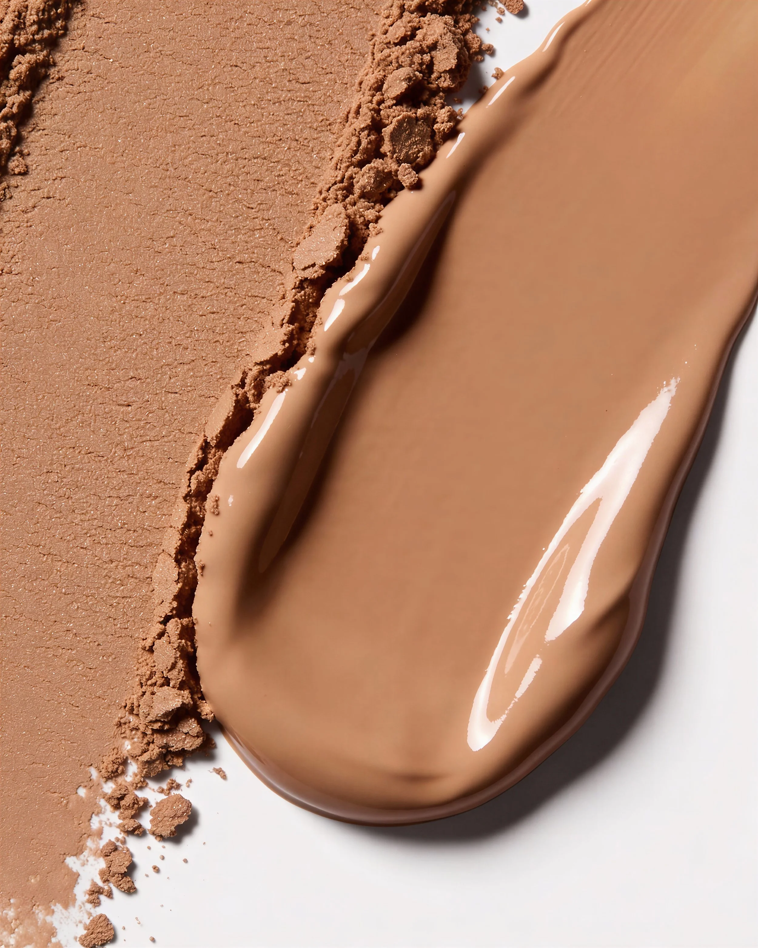
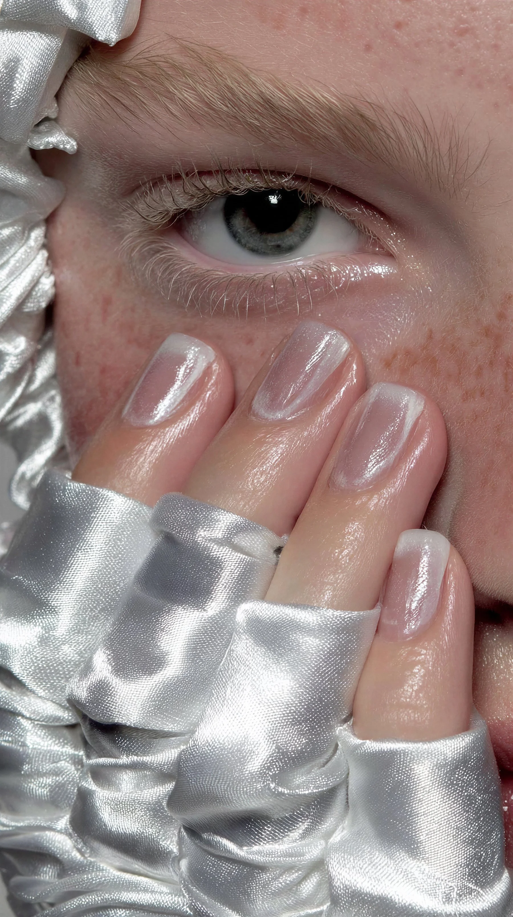
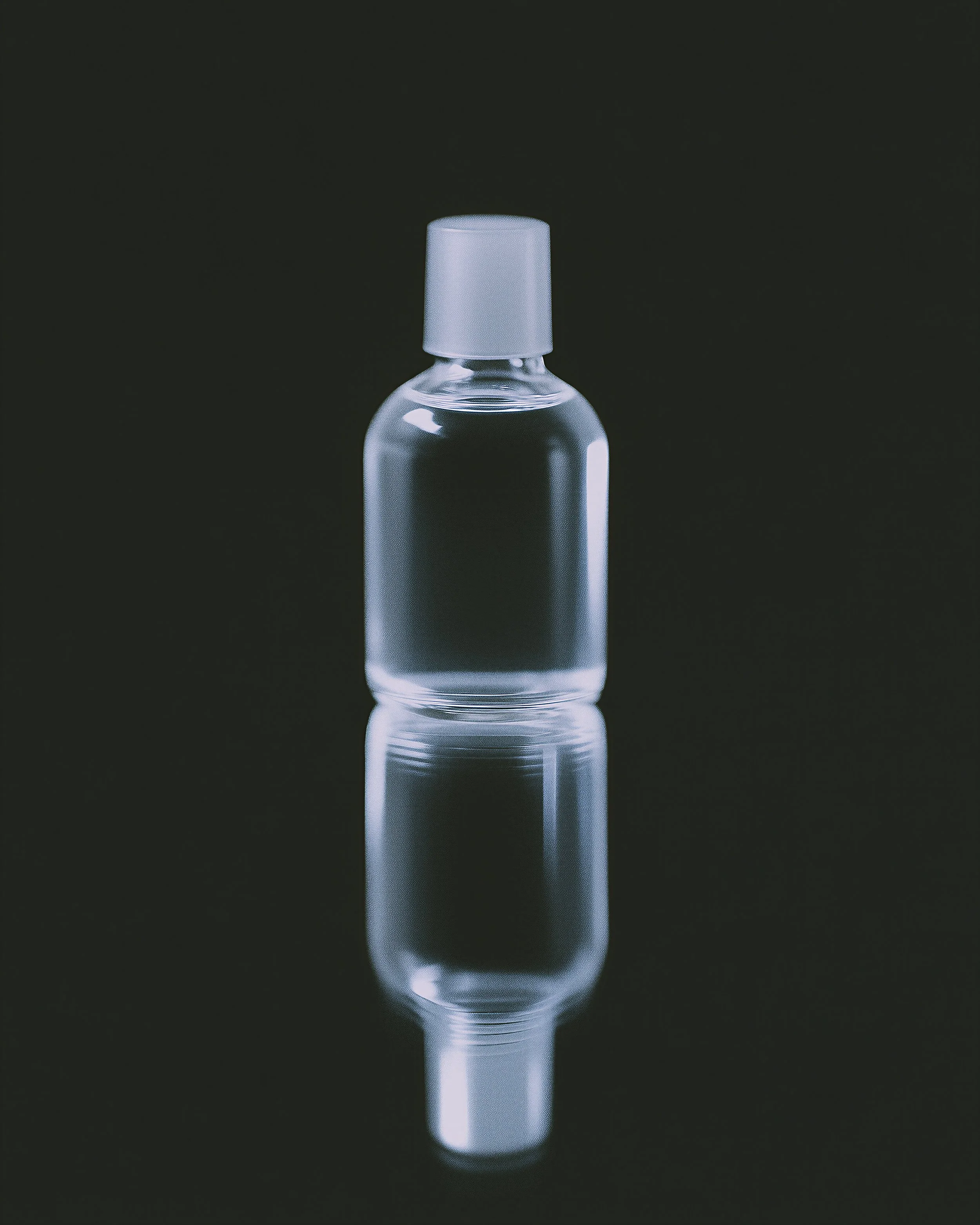
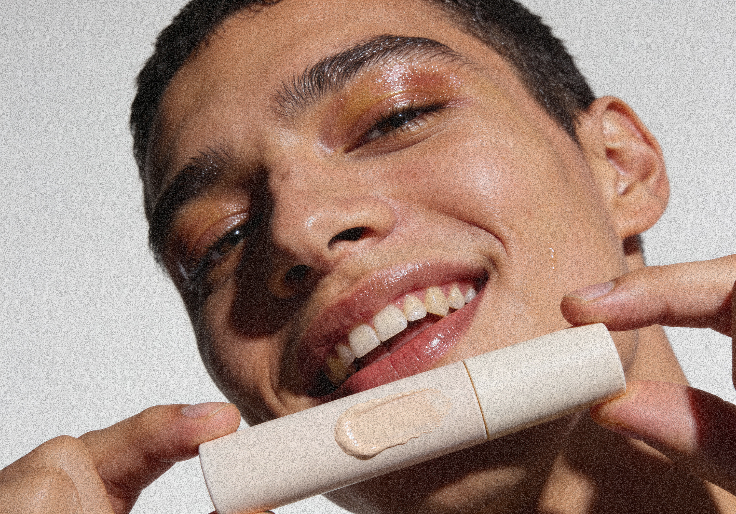
PhotographyI curated a nostalgic, raw brand photography system through nonchalant-looking model portraits, close-up shots of makeup swatches with visible skin texture, and image treatments that reduce saturation, lower brightness, and add coloured noise. The result mirrors the brand’s rawness and boundlessness.
Results & Impact
I produced this visual identity system, a collection of OOH ads, a website concept, social media posts, and packaging designs in 2 weeks.